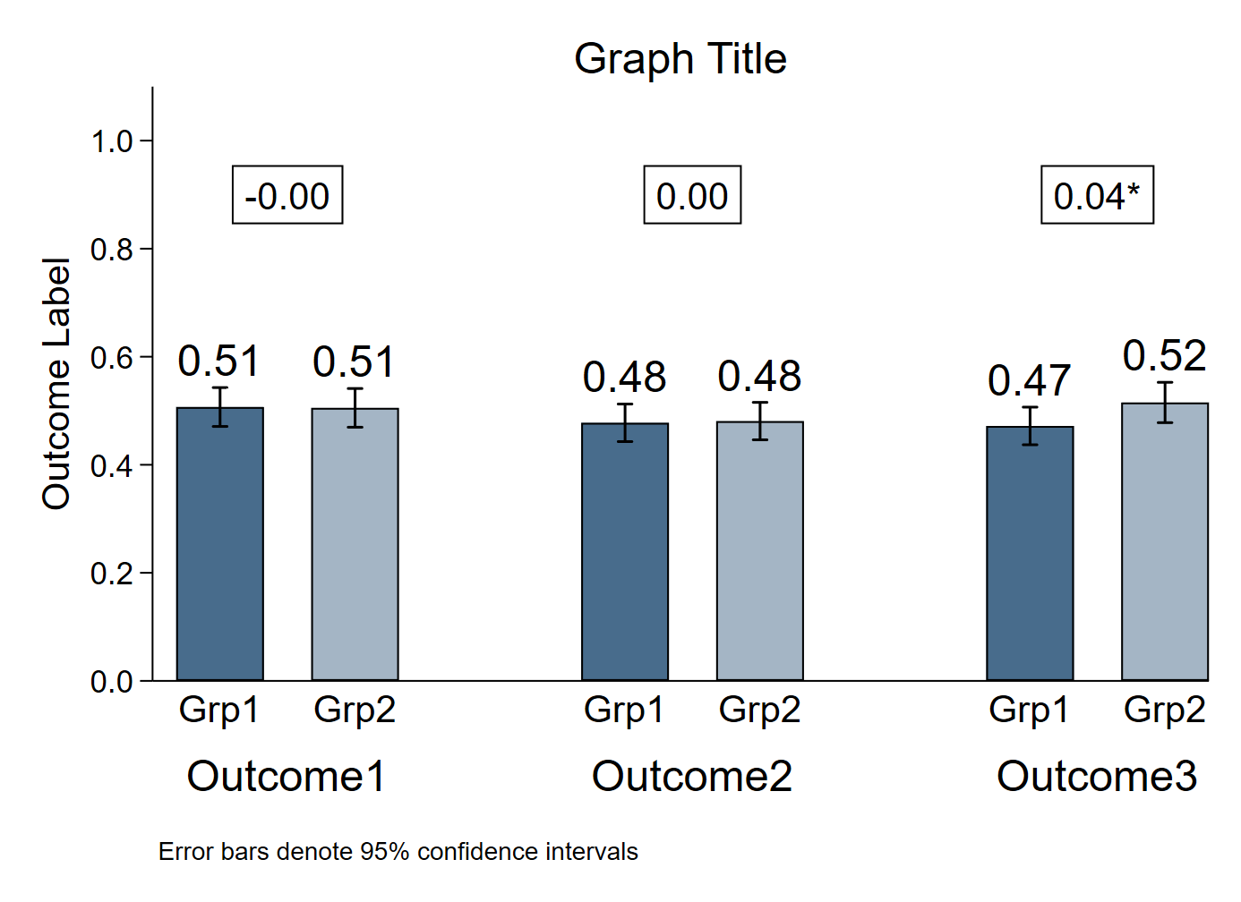
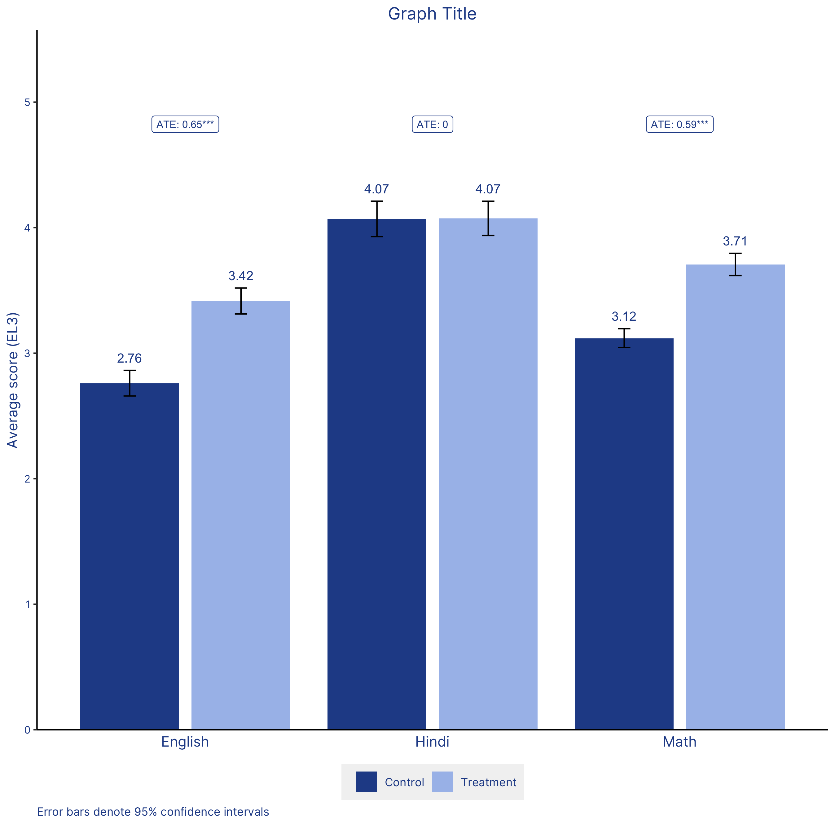
The chart
Stata

R

Data
Dataset used to create the R version of the graph can be found here.
The code
Stata
* Create fake dataset (delete this section and import your own data)
clear
set obs 500
forval i = 1/3{
	gen outcome_var`i' = runiform()
}
gen group_var = (_n > 0.5*_N)

* Enter your relevant variable names here
local outcome1 outcome_var1
local outcome2 outcome_var2
local outcome3 outcome_var3
local group group_var

* Change the graph font here if you want
// graph set window fontface "Times New Roman"

* Create variables for graph
gen xaxis = _n in 1/8
gen group1 = 0 if (_n == 1 | _n == 4 | _n == 7)
replace group1 = 1 if (_n == 2 | _n == 5 | _n == 8)
gen means = .
gen ci_high = .
gen ci_low = .

* Calculate means, CIs
local j 1
forval i = 1/3{

	* Group 1 values
	mean `outcome`i'' if `group' == 0
	matrix A = r(table)
	replace means = A[1,1] in `j'
	replace ci_low = A[5,1] in `j'
	replace ci_high = A[6,1] in `j'
	local ++j

	* Group 2 values
	mean `outcome`i'' if `group' == 1
	matrix A = r(table)
	replace means = A[1,1] in `j'
	replace ci_low = A[5,1] in `j'
	replace ci_high = A[6,1] in `j'
	local ++j
	local ++j

	* ATE
	reg `outcome`i'' `group', robust
	matrix A = r(table)
	local ate`i' = A[1,1]
	local ate`i': disp %3.2f `ate`i''
	local pval = A[4,1]
	if `pval' < 0.1{
		local pval_stars`i' *
	}
	if `pval' < 0.05{
		local pval_stars`i' **
	}
	if `pval' < 0.01{
		local pval_stars`i' ***
	}

}

* Format labels for bar heights
format %3.2f means

* Graph
twoway 	(bar means xaxis if group1 == 0, fcolor(navy) lcolor(black) barwidth(0.65)) ///
		(bar means xaxis if group1 == 1, fcolor(navy*0.5) lcolor(black) barwidth(0.65)) ///
		(rcap ci_high ci_low xaxis, lcolor(black)) ///
		(scatter ci_high xaxis, msymbol(none) mlabel(means) mlabsize(large) mlabcolor(black) mlabposition(12)) ///
		, ///
		text(0.9 1.5 "`ate1'`pval_stars1'", box fcolor(none) lcolor(black) size(medlarge) margin(small)) ///
		text(0.9 4.5 "`ate2'`pval_stars2'", box fcolor(none) lcolor(black) size(medlarge) margin(small)) ///
		text(0.9 7.5 "`ate3'`pval_stars3'", box fcolor(none) lcolor(black) size(medlarge) margin(small)) ///
		xtitle(" ") ///
		xlabel(1 "Grp1" 2 "Grp2" 4 "Grp1" 5 "Grp2" 7 "Grp1" 8 "Grp2", labsize(medlarge) notick) ///
		xmlabel(1.5 "Outcome1" 4.5 "Outcome2" 7.5 "Outcome3", labsize(large) notick labgap(*11)) ///
		xscale(range(0.5 2.5)) ///
		ylabel(0(0.2)1, format(%3.1f) angle(horizontal)) ///
		yscale(range(0 1.1)) ///
		ytitle("Outcome Label", size(medlarge)) ///
		title("Graph Title") ///
		note("Error bars denote 95% confidence intervals") ///
		legend(off) ///
		scheme(s1color) ///
		plotregion(margin(zero) style(none))
graph export "Bar graph with CIs_2 groups 3 outcomes.png", replace
R
# Bar graph with CIs - 2 groups and 3 outcomes

############################### Initial Setup ##################################
# Install required packages if they are not already in your system
packages <- c('tidyverse')

lapply(packages, function(i) {if(!i %in% installed.packages() == T) {install.packages(i, dependencies = TRUE, repos='http://cran.rstudio.com/')}})

# Loading required packages
library("tidyverse")

# Setting working directory
setwd("~/Dropbox (IDinsight)/Data visualization library")

############################### Loading dataset ################################
# Loading EG DIB dataset in csv format
mydata <- read_csv("Data/EG_DIB.csv, show_col_types = FALSE")

############################### Data processing ################################
# The 2 groups will be given by the treatment status - control and treatment
# Variable: treatment
# The 3 outcomes are endline 3 English, Math and Hindi test scores
# Variables: math_ely3_villavg english_ely3_villavg hindi_ely3_villavg

# Converting the treatment variable to a factor(categorical) variable
# This is because treatment will appear on the x-axis and it has only 2
# values (discrete)
mydata$treatment <- as.factor(mydata$treatment)

# The dataset is currently in wide format. Each row is an individual village.
# We need to transform this to a long format. The target dataset will have
# columns to indicate:
# 1. Village
# 2. Treatment status
# 3. Subject (Math/Hindi/English)
# 4. Score

mydata_long <- mydata %>%
  select(village_id_rand, treatment, hindi_ely3_villavg, english_ely3_villavg,
         math_ely3_villavg) %>%
  gather(key = "subject", value = "score", 3:5) %>%
  arrange(village_id_rand)

# cleaning up the subject column
mydata_long$subject <- str_sub(mydata_long$subject, end = -14)


# Creating the means, CIs and ATE

# Assuming 95% CI
alpha = 0.05

# Creating means and CI and storing in my_sum tibble
my_sum <- mydata_long %>%
  group_by(treatment, subject) %>%
  summarise(n = n(),
            mean = mean(score, na.rm = T),
            sd = sd(score, na.rm = T)) %>%
  mutate(se = sd/sqrt(n)) %>%
  mutate(ic = se * qt((1-alpha)/2 + 0.5, n - 1))

# Creating the ATEs and p-value stars indicating significance
subjects <- vector()
ates <- vector()
p_stars <- vector()

counter <- 1

# Running the regression model for each subject
for(i in levels(as.factor(mydata_long$subject))) {
  model <- lm(score ~ treatment, data = filter(mydata_long, subject == i))

  # Storing the subject
  subjects[counter] <- i

  # Storing the ATE
  ates[counter] <- summary(model)$coefficients[2,1]

  # Storing the p value
  p_value <- summary(model)$coefficients[2,4]

  # Creating a variable to store the significance stars
  if(p_value < 0.01) {
    p_stars[counter] = "***"
  } else if (p_value < 0.05) {
    p_stars[counter] = "**"
  } else if (p_value < 0.1) {
    p_stars[counter] = "*"
  } else {
    p_stars[counter] = ""
  }

  counter = counter + 1
}

# Creating a tibble with the subject, ATE and significance stars
ate_df <- tibble(subjects, ates, p_stars)


############################### Creating the graph #############################
# Define axis and fill variable
x_values <- my_sum$subject
y_values <- my_sum$mean
fill_by <- my_sum$treatment

plot <- my_sum %>%
  # Setting aesthetics which will be inherited by other geometric objects
  ggplot(aes(x = x_values, y = y_values, fill = fill_by)) +

  # Position dodge applied so that the bars are not superimposed
  geom_bar(stat = "identity", position = position_dodge(width = 0.9),
           width = 0.8) +

  # Changing the bar colors according to IDinsight colors
  scale_fill_manual(values = c("#264D96", "#A8BFEB"),
                    labels = c("Control", "Treatment")) +

  # Changing x-axis labels to capitalize subject name
  scale_x_discrete(labels =  c("English", "Hindi", "Math")) +

  # Adding Error bars
  # As with geom_bar, position dodge has been applied here as well so that the
  # error bars are not superimposed
  geom_errorbar(aes(ymin = y_values - ic, ymax = y_values + ic),
                width = 0.1,
                size = 0.5,
                position = position_dodge(width = 0.9)) +

  ##>>> rounding the lables to two decimals
  # Adding text to display the mean of each bar. It is placed 0.1 units above
  # (mean + ic)
  geom_text(aes(y = y_values + ic + 0.1,
                label = round(y_values, 2)),
                size = 3.5,
                color = "#264D96",
                position = position_dodge(width = 0.9)) +

  # Setting the limits of the y-axis. The expand function with (0, 0) removes
  # the gap between the data the axis
  scale_y_continuous(expand = c(0, 0),
                     limits = c(0, max(y_values) + 1.5)) +

  # Annotation for the 3 ATEs
  # Please note that this can be made into a single annotate layer through the
  # following format:
  # annotate(geom = "label", x = 1:2, y = 20:21, label = c("label 1", "label 2"))
  annotate(geom = "label", x = 1, y = (max(y_values) + 0.75),
           label = paste0("ATE: ",
                          round(ate_df$ates[ate_df$subjects == "english"], digits = 2),
                          ate_df$p_stars[ate_df$subjects == "english"]),
           size = 2.8,
           color = "#264D96") +
  annotate(geom = "label", x = 2, y = (max(y_values) + 0.75),
           label = paste0("ATE: ",
                          round(ate_df$ates[ate_df$subjects == "hindi"], digits = 2),
                          ate_df$p_stars[ate_df$subjects == "hindi"]),
           size = 2.8,
           color = "#264D96") +
  annotate(geom = "label", x = 3, y = (max(y_values) + 0.75),
           label = paste0("ATE: ",
                          round(ate_df$ates[ate_df$subjects == "math"], digits = 2),
                          ate_df$p_stars[ate_df$subjects == "math"]),
           size = 2.8,
           color = "#264D96") +

  # Creating graph title, axis title and caption
  labs(title = "Graph Title",
       y = "Average score (EL3)",
       caption = "Error bars denote 95% confidence intervals")

############################# Formatting the graph #############################
plot +
  theme_classic() +
  # The following visual changes have been made:
    # Changed the font family to Inter
    # Legend title has been removed
    # Legend box has been moved to the bottom of the plot
    # Legend text has been modified
    # Legend box background color has been changed to a very light gray
    # Plot title font has been changed
    # Plot caption font has been changed and left aligned
    # X-axis title has been removed
    # Y-axis title font color has been changed
    # X-axis text color and size has been changed
    # X-axis ticks have been removed
    # Y-axis text size and color has been changed
theme(text = element_text(family = "Inter"),
      legend.title = element_blank(),
      legend.position = "bottom",
      legend.text = element_text(color = "#264D96"),
      legend.background = element_rect(fill = "gray95", size = 0.25,
                                       linetype = "dotted"),
      plot.title = element_text(hjust = 0.5, color = "#264D96"),
      plot.caption = element_text(hjust = 0, color = "#264D96"),
      axis.title.x = element_blank(),
      axis.title.y = element_text(color = "#264D96"),
      axis.text.x = element_text(size = 11, color = "#264D96"),
      axis.ticks.x = element_blank(),
      axis.text.y = element_text(size = 8, color = "#264D96"))

############################## Saving and exporting ############################
# Indicating the export folder and the image file name
export_folder <- "R/Bar graphs/Exports/"
img_name <- "bar_graph_ci_3_outcomes_R_reviewed.png"
ggsave(paste(export_folder, img_name,sep = ""))
Other details
R
Code written by Arkadeep Bandyopadhyay and reviewed by Sandra Alemayehu.
Colors for the graph have been selected from IDinsight’s brand guide.