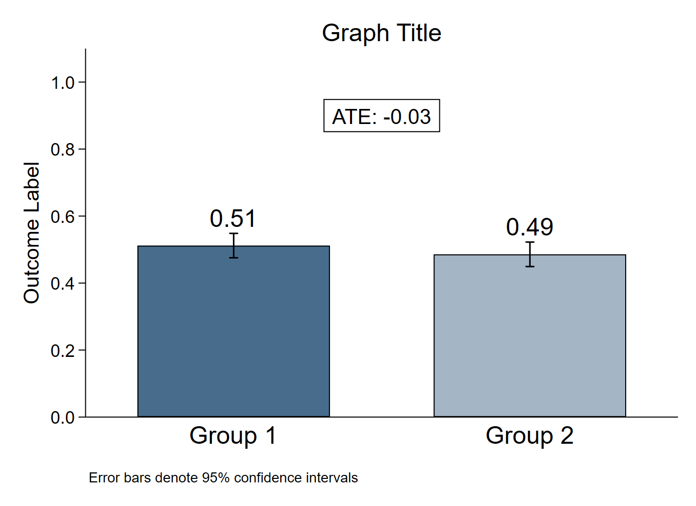
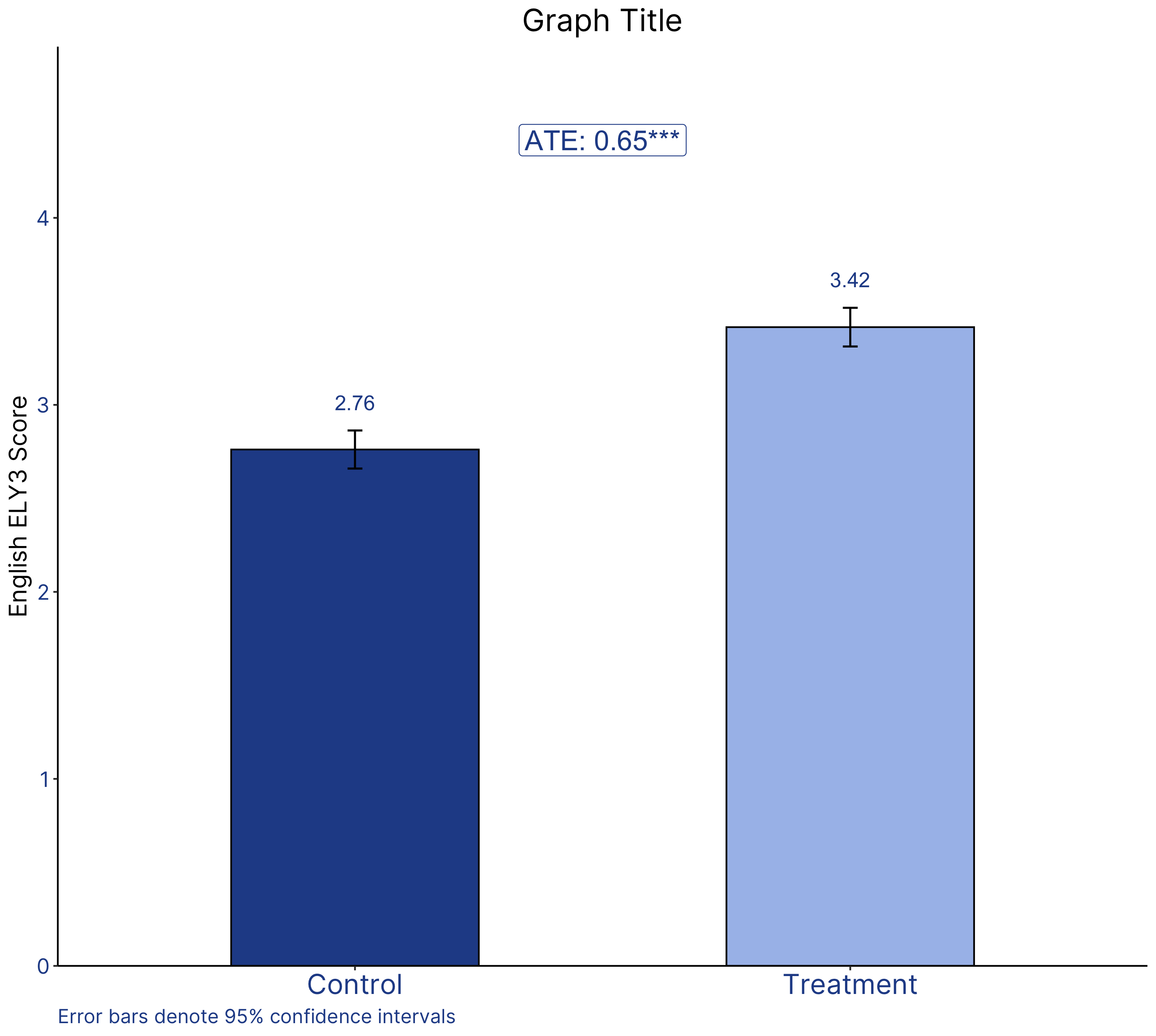
The chart
Stata

R

The R graph looks different since it has been created using a different dataset.
Data
Dataset used to create the R version of the graph can be found here.
The code
Stata
* Create fake dataset (delete this section and import your own data)
clear
set obs 500
gen outcome_var = runiform()
gen group_var = (_n > 0.5*_N)

* Enter your relevant variable names here
local outcome outcome_var
local group group_var

* Change the graph font here if you want
// graph set window fontface "Times New Roman"

* Create variables for graph
gen xaxis = _n in 1/2
gen means = .
gen ci_high = .
gen ci_low = .

* Calculate means, CIs, ATE

	* Group 1 values
	mean `outcome' if `group' == 0
	matrix A = r(table)
	replace means = A[1,1] in 1
	replace ci_low = A[5,1] in 1
	replace ci_high = A[6,1] in 1

	* Group 2 values
	mean `outcome' if `group' == 1
	matrix A = r(table)
	replace means = A[1,1] in 2
	replace ci_low = A[5,1] in 2
	replace ci_high = A[6,1] in 2

	* ATE
	reg `outcome' `group', robust
	matrix A = r(table)
	local ate = A[1,1]
	local ate: disp %3.2f `ate'
	local pval = A[4,1]
	if `pval' < 0.1{
		local pval_stars *
	}
	if `pval' < 0.05{
		local pval_stars **
	}
	if `pval' < 0.01{
		local pval_stars ***
	}


* Format labels for bar heights
format %3.2f means

* Graph
twoway 	(bar means xaxis if xaxis == 1, fcolor(navy) lcolor(black) barwidth(0.65)) ///
		(bar means xaxis if xaxis == 2, fcolor(navy*0.5) lcolor(black) barwidth(0.65)) ///
		(rcap ci_high ci_low xaxis, lcolor(black)) ///
		(scatter ci_high xaxis, msymbol(none) mlabel(means) mlabsize(large) mlabcolor(black) mlabposition(12)) ///
		, ///
		text(0.9 1.5 "ATE: `ate'`pval_stars'", box fcolor(none) lcolor(black) size(medlarge) margin(small)) ///
		xtitle(" ") ///
		xlabel(1 "Group 1" 2 "Group 2", labsize(large) notick) ///
		xscale(range(0.5 2.5)) ///
		ylabel(0(0.2)1, format(%3.1f) angle(horizontal)) ///
		yscale(range(0 1.1)) ///
		ytitle("Outcome Label", size(medlarge)) ///
		title("Graph Title") ///
		note("Error bars denote 95% confidence intervals") ///
		legend(off) ///
		scheme(s1color) ///
		plotregion(margin(zero) style(none))
graph export "Bar graph with CIs_2 bars.png", replace
R
# Bar graph with CIs - 2 groups

################################ Initial Setup #################################
# Install required packages if they are not already in your system
packages <- c('tidyverse')

lapply(packages, function(i) {if(!i %in% installed.packages() == T)
  {install.packages(i, dependencies = TRUE, repos='http://cran.rstudio.com/')}})

# Loading required packages
library("tidyverse")

# Setting working directory
setwd("~/Dropbox (IDinsight)/Data visualization library")

############################## Loading dataset #################################
mydata <- read_csv("Data/EG_DIB.csv")

############################## Data processing #################################
##>>> Setting correct data type
# Converting the treatment variable to a factor(categorical) variable
# This is because treatment will appear on the x-axis and it has only 2
# values (discrete)
mydata$treatment <- as.factor(mydata$treatment)

# Creating the means, CIs and ATE

# Assuming 95% CI
alpha = 0.05

# Creating means and CI and storing in my_sum tibble
my_sum <- mydata %>%
  group_by(treatment) %>%
  summarise(n = n(),
            mean = mean(english_ely3_villavg, na.rm = T),
            sd = sd(english_ely3_villavg, na.rm = T)
            ) %>%
  mutate(se = sd/sqrt(n)) %>%
  mutate(ic = se * qt((1-alpha)/2 + 0.5, n - 1))

# Obtaining the value of ATE and corresponding p value
model <- lm(english_ely3_villavg ~ treatment, data = mydata)
ate <- summary(model)$coefficients[2,1]
p_value <- summary(model)$coefficients[2,4]

  # Creating a variable to store the significance stars
  if(summary(model)$coefficients[2,4] < 0.01) {
    p_stars = "***"
  } else if (summary(model)$coefficients[2,4] < 0.05) {
    p_stars = "**"
  } else if (summary(model)$coefficients[2,4] < 0.1) {
    p_stars = "*"
  } else {
    p_stars = ""
  }

############################## Creating the graph ##############################
# Define axis and fill variable
x_values <- my_sum$treatment
y_values <- my_sum$mean
fill_by <- my_sum$treatment

plot1 <- ggplot(my_sum) +
  # Geometric object for the bars
  # fill inside the aes function determines the color inside the bar. Here the
  # color changes based on the value of fill_by (treatment)
  # color outside of the aes function determines the outline color. Here we have
  # set it to black
  # "identity" selected for stat since we want the heights of the bars to
  # represent values in the data. The default, "bin" makes the height of each
  # bar equal to the number of cases in each group.
  # width determines the width of the bars
  geom_bar(aes(x = x_values, y = y_values, fill = fill_by),
           color = "black",
           stat = "identity",
           width = 0.5) +

  # Manually coloring the two bars according to IDinsight colors
  scale_fill_manual(values = c("#264D96", "#A8BFEB")) +

  # Manually labeling the x-axis ticks for the two bars
  # scale_x_discrete instead of continuous because the treatment variable
  # is a factor
  scale_x_discrete(breaks = c(0, 1),
                   labels = c("Control", "Treatment")) +

  # The y-axis is continuous since the the English scores can have values such
  # as 1.5, 3.8, etc.
  # The expand function provides padding around the data so that it is presented
  # some distance away from the axes. In this case, we are removing the padding.
  # The limits function is providing the range of data to be displayed on the
  # y-axis. Here, we are starting from 0 and ending it 1.5 units above the
  # maximum value of the mean English end line 3 score. We are doing this to
  # ensure that the ATE box has enough vertical space to be visible.
  scale_y_continuous(expand = c(0, 0),
                     limits = c(0, max(y_values) + 1.5)) +

  # Geometric object for adding the error bars
  geom_errorbar(aes(x = treatment, ymin = y_values - ic, ymax = y_values + ic),
                width = 0.03,
                size = 0.6) +

  # Geometric object for adding the mean of the bars on top of the upper bound
  # of the CI
  # The y value of (y_values + ic + 0.15) indicates that the text should appear
  # 0.15 units above (y_values + ic)
  geom_text(aes(x = x_values, y = y_values + ic + 0.15,
                label = round(y_values, 2)), size = 4.5, color = "#264D96") +

  # Annotate lets us to place the ATE box.
  # The y-coordinate is placed 1 unit above the maximum value of the means
  # The x-coordinate is placed in the center of the two bars 1 and 2 and
  # hence takes the value 1.5
  # paste0 is a function which concatenates strings and objects
  annotate(geom = "label", x = 1.5, y = (max(y_values) + 1),
           label = paste0("ATE: ", round(ate, digits = 2), p_stars),
           size = 6, color = "#264D96") +

  # Creating titles for the graph
  labs(title = "Graph Title",
       y = "English ELY3 Score",
       caption = "Error bars denote 95% confidence intervals")

############################ Formatting the graph ##############################
plot1 +
  # Classic theme removes grid lines and background
  theme_classic() +

  # Custom theme elements will come AFTER a pre-built theme has been applied
  # The following changes have been made:
    # Applied the Inter font to all text elements on the graph
    # Removed x-axis title
    # Increased the size the of y-axis title
    # Changed the color and font size of the x-axis labels
    # Changed the color and font size of the y-axis labels
    # Removed the legend
    # Center aligned the graph title and increased its size
    # Left aligned the caption and changed caption color
  theme(text = element_text(family = "Inter"),
        axis.title.x = element_blank(),
        axis.title.y = element_text(size = 15),
        axis.text.x = element_text(size = 17, color = "#264D96"),
        axis.text.y = element_text(size = 13, color = "#264D96"),
        legend.position = "none",
        plot.title = element_text(hjust = 0.5, size = 19),
        plot.caption = element_text(hjust = 0, colour = "#264D96",
                                    size = 12))

########################## Saving and exporting ################################
#indicating the export folder and the image file name
export_folder <- "R/Bar graphs/Exports/"
img_name <- "bar_graph_ci_R_reviewed.png"
ggsave(paste(export_folder,img_name,sep = ""))
Other details
R
Code written by Arkadeep Bandyopadhyay and reviewed by Sandra Alemayehu.
Colors for the graph have been selected from IDinsight’s brand guide.