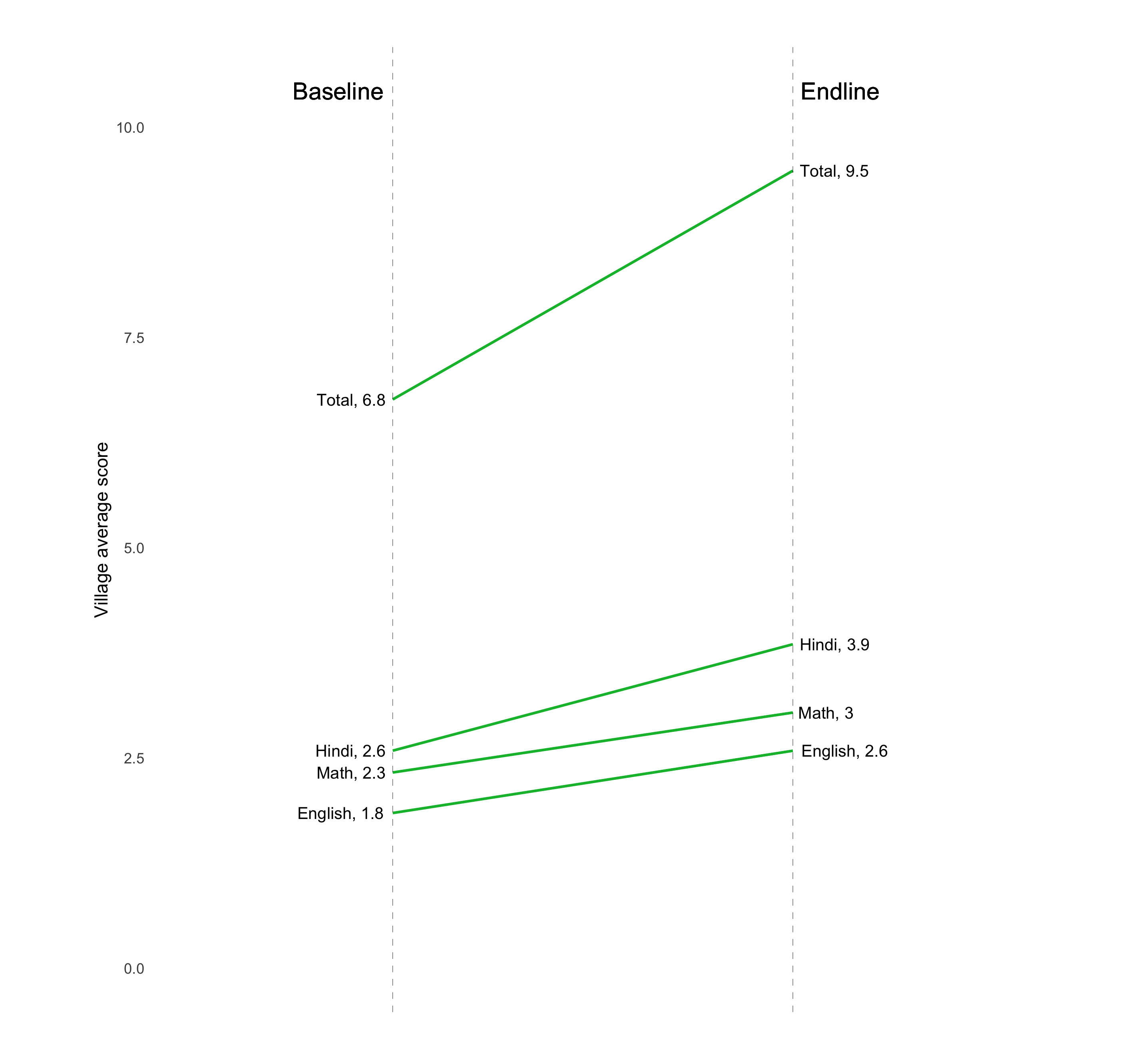
The chart
R

Based on this.
Data
Dataset used to create the R version of the graph can be found here.
The code
R
# Slope chart

############################## Initial Setup ###################################
# Install required packages if they are not already in your system
packages <- c( 'tidyverse', 'scales')

lapply(packages, function(i) {if(!i %in% installed.packages() == T)
{install.packages(i, dependencies = TRUE, repos='http://cran.rstudio.com/')}})

# Loading required packages
library("tidyverse")
library("scales")


# Setting working directory
setwd("~/Dropbox (IDinsight)/Data visualization library")

############################### Loading dataset ################################
mydata <- read_csv("Data/EG_DIB.csv", show_col_types = FALSE)

################################ Data processing ###############################
# In this scenario, will be looking at the evolution scores between
  # baseline and the first endline.
  # The data will be in the following format:
    # Subject column
    # Baseline score column
    # Endline score column
    # Trend indicator column (optional) - this column stores a color to indicate
    # the direction of the scores. In this case, red will indicate that scores
    # went down between the two time periods while green will indicate that
    # scores went up. We are giving

  data_process <- mydata %>%
    summarise(english_bl = mean(english_bl_villavg),
              math_bl = mean(math_bl_villavg),
              hindi_bl = mean(hindi_bl_villavg),
              total_bl = mean(total_bl_villavg),
              english_el = mean(english_ely1_villavg),
              math_el = mean(math_ely1_villavg),
              hindi_el = mean(hindi_ely1_villavg),
              total_el = mean(total_ely1_villavg)) %>%
    pivot_longer(everything(),
                 names_to = c("subject", "time"),
                 names_sep = "_",
                 values_to = "score") %>%
    pivot_wider(names_from = time,
                values_from = score) %>%
    mutate(trend = (ifelse(el - bl < 0, "red", "green")))

  # Capitalizing the first letter of each subject. Turns hindi into Hindi
  data_process$subject <- str_to_sentence(data_process$subject)

  # Variables to store the elements which will be displayed on the graph
  left_label <- paste(data_process$subject, round(data_process$bl, 1),sep = ", ")
  right_label <- paste(data_process$subject, round(data_process$el, 1),sep = ", ")


############################# Creating the graph ###############################
plot <- data_process %>%
  ggplot() +

  # To draw the lines between (x, y) and (xend, yend)
  geom_segment(aes(x = 1, xend = 2, y = bl, yend = el, col = trend),
               size = 0.75, show.legend = FALSE) +


  # For the vertical lines to indicate baseline and endline
  geom_vline(xintercept = 1, linetype="dashed", size=.1) +
  geom_vline(xintercept = 2, linetype="dashed", size=.1) +

  # For the color of the lines between baseline and endline
  scale_color_manual(labels = c("Up", "Down"),
                     values = c("green"="#00ba38", "red"="#f8766d")) +

  # Axis labels
  labs(y = "Village average score") +

  # Limits of the x and y axes
  xlim(.5, 2.5) +
  ylim(0, (1.1*(max(data_process$bl, data_process$el)))) +

  # Adding the subject and score labels.
  # The rep function determines the number of times "1" will be repeated. In
  # this case, it is being repeated 4 times, since data_process has 4 rows. This
  # corresponds with the number of subjects we have (Hindi, Math, English and
  # Total)
  geom_text(label = left_label, y = data_process$bl,
            x = rep(1, nrow(data_process)),
            hjust = 1.1, size = 3.5) +
  geom_text(label = right_label, y = data_process$el,
            x = rep(2, nrow(data_process)),
            hjust = -0.1, size = 3.5) +

  # Adding the baseline and endline labels, positioned at x = 1 and x = 2
  # respectively. They are positioned 10% above the maximum score.
  geom_text(label = "Baseline", x = 1,
            y = 1.1 * (max(data_process$bl, data_process$el)),
            hjust = 1.1, size = 5) +
  geom_text(label = "Endline", x = 2,
            y = 1.1 * (max(data_process$bl, data_process$el)),
            hjust = -0.1, size = 5)

plot +
  # The following visual elements have been modified:
    # Removed all background elements such as color, gridlines, etc
    # Removed axis ticks
    # Removed x-axis title
    # Removed x-axis text
    # Customized the plot margins
  theme(panel.background = element_blank(),
        axis.ticks = element_blank(),
        axis.title.x = element_blank(),
        axis.text.x = element_blank(),
        plot.margin = unit(c(1,2,1,2), "cm"))

# Saving and exporting
ggsave("R/Other graphs/Exports/slope_chart_R.png")
Other details
R
Code written by Arkadeep Bandyopadhyay.