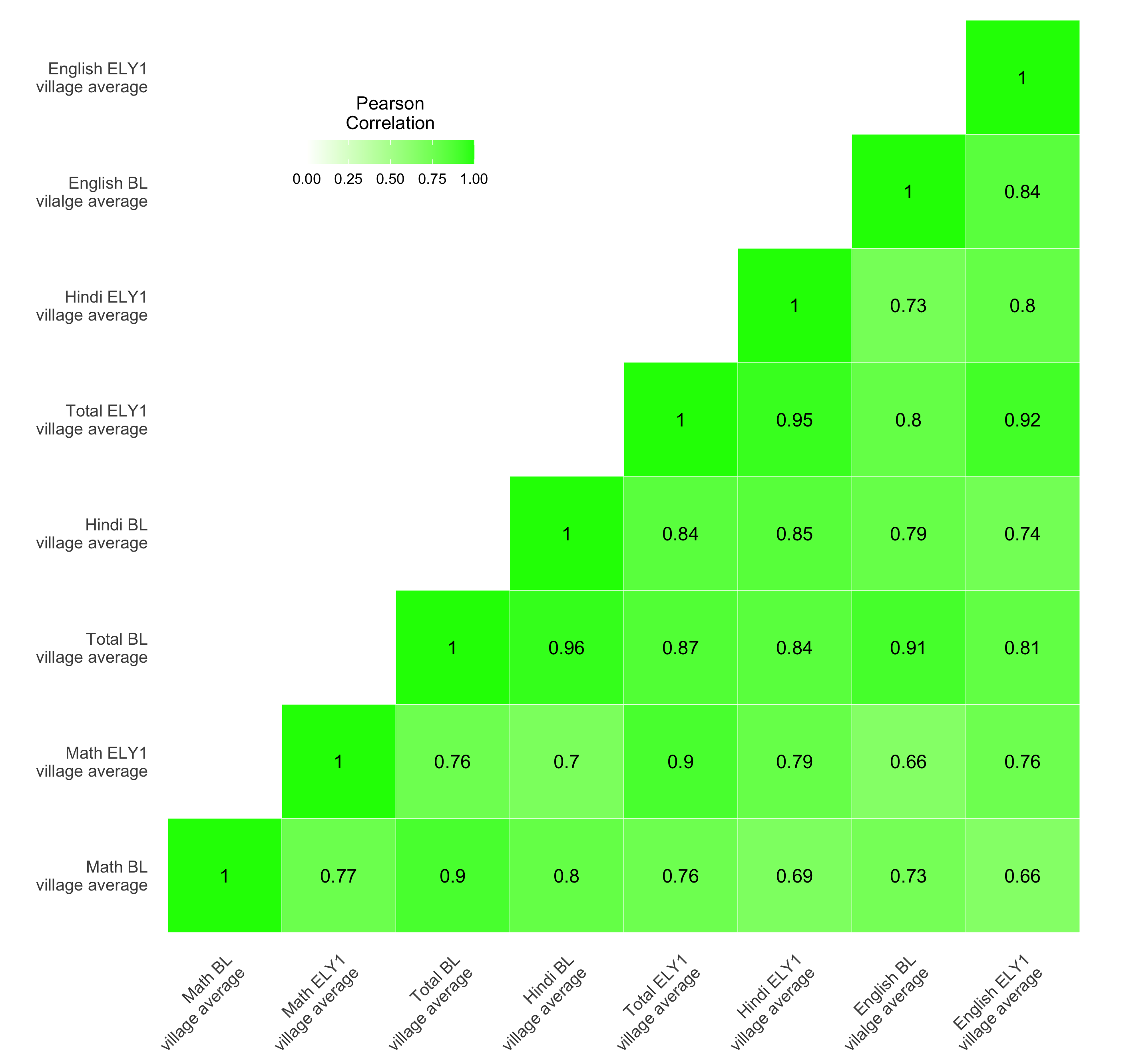
The chart
R

Data
Dataset used to create the R version of the graph can be found here.
The code
R
# Correlogram

############################## Initial Setup ###################################
# Install required packages if they are not already in your system
packages <- c( 'tidyverse', 'reshape2')

lapply(packages, function(i) {if(!i %in% installed.packages() == T)
{install.packages(i, dependencies = TRUE, repos='http://cran.rstudio.com/')}})


# Loading required packages
library("tidyverse")
library("reshape2")


# Setting working directory
setwd("~/Dropbox (IDinsight)/Data visualization library")

############################### Loading dataset ################################
mydata <- read_csv("Data/EG_DIB.csv", show_col_types = FALSE)

################################ Data processing ###############################
# Creating two functions to process the data

  # Reordering the correlation matrix
  reorder_cormat <- function(cormat){
    # Use correlation between variables as distance
    dd <- as.dist((1-cormat)/2)
    hc <- hclust(dd)
    cormat <-cormat[hc$order, hc$order]
  }

  # Get upper triangle of the correlation matrix
  get_upper_tri <- function(cormat){
    cormat[lower.tri(cormat)]<- NA
    return(cormat)
  }


# Creating correlation matrix
# In this example, we are going to focus on the baseline and endline year 1
# scores only
cormat <- mydata %>%
  select(ends_with(c("bl_villavg", "ely1_villavg"))) %>%
  cor() %>%
  round(2)

# Applying functions that we created previously
cormat <- reorder_cormat(cormat)
upper_tri <- get_upper_tri(cormat)

# Reshaping
melted_cormat <- melt(upper_tri, na.rm = TRUE)

############################# Creating the graph ###############################
plot <- melted_cormat %>%

  # Setting aesthetic which will be inherited by other geometric objects
  ggplot(aes(x = Var2, y = Var1, fill = value))+

  # Setting the border color of each tile to white
  geom_tile(color = "white") +

  # The correlation value is set inside the aesthetic and is being displayed
  # in black text color
  geom_text(aes(label = value), color = "black", size = 4) +

  # Limit kept between zero and one since no pair has negative correlation
  scale_fill_gradient2(high = "green",
                       limit = c(0, 1),
                       space = "Lab",
                       name="Pearson\nCorrelation") +

  # Creating the x and y axes labels
  # \n is a new line character
  scale_x_discrete(labels = c("english_ely1_villavg" = "English ELY1\nvillage average",
                              "math_bl_villavg" = "Math BL\nvillage average",
                              "total_bl_villavg" = "Total BL\nvillage average",
                              "hindi_bl_villavg" = "Hindi BL\nvillage average",
                              "english_bl_villavg" = "English BL\nvilalge average",
                              "hindi_ely1_villavg" = "Hindi ELY1\nvillage average",
                              "math_ely1_villavg" = "Math ELY1\nvillage average",
                              "total_ely1_villavg" = "Total ELY1\nvillage average")) +
  scale_y_discrete(labels = c("english_ely1_villavg" = "English ELY1\nvillage average",
                              "math_bl_villavg" = "Math BL\nvillage average",
                              "total_bl_villavg" = "Total BL\nvillage average",
                              "hindi_bl_villavg" = "Hindi BL\nvillage average",
                              "english_bl_villavg" = "English BL\nvilalge average",
                              "hindi_ely1_villavg" = "Hindi ELY1\nvillage average",
                              "math_ely1_villavg" = "Math ELY1\nvillage average",
                              "total_ely1_villavg" = "Total ELY1\nvillage average"))


plot +
  # The following visual elements have been modified:
    # x-axis text: Rotated the text to 45 degrees, resized it and changed the
    # vertical and horizontal alignment
    # y-axis text: Resized
    # Removed x and y axis titles
    # Removed the plot background
    # Removed the axis ticks
    # Changed the justification of the legend
    # Set the position of the legend
    # Changed the direction of the legend to be horizontal
  theme(axis.text.x = element_text(angle = 45, vjust = 1,
                                   size = 10, hjust = 1),
        axis.text.y = element_text(size = 10),
        axis.title = element_blank(),
        panel.background = element_blank(),
        axis.ticks = element_blank(),
        legend.justification = c(1, 0),
        legend.position = c(0.35, 0.8),
        legend.direction = "horizontal") +

  # coord_fixed with ration 1 ensures that the x and y axis scales are 1:1
  coord_fixed(ratio = 1) +

  # Changed the position of the legend title, horizontal alignment, bar width
  # and bar height
  guides(fill = guide_colorbar(barwidth = 7, barheight = 1,
                               title.position = "top", title.hjust = 0.5))


############################# Saving and exporting #############################
# indicating the export folder and the image file name
export_folder <- "R/Other graphs/Exports/"
img_name <- "correlogram_R.png"
ggsave(paste(export_folder,img_name,sep = ""))
Other details
R
Code written by Arkadeep Bandyopadhyay.