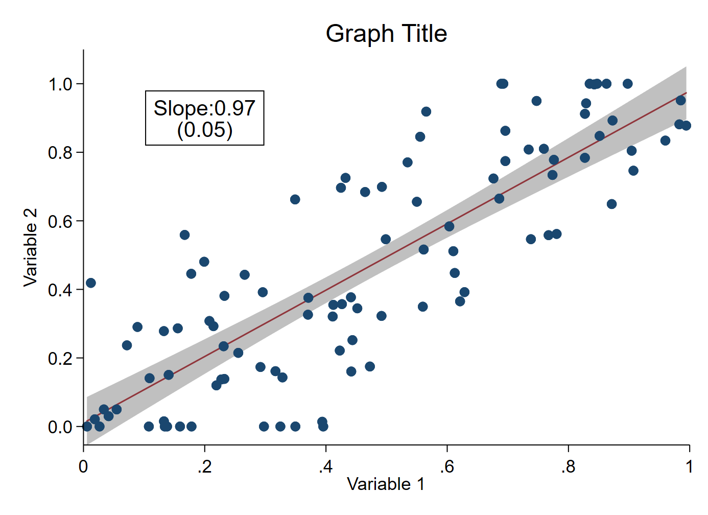
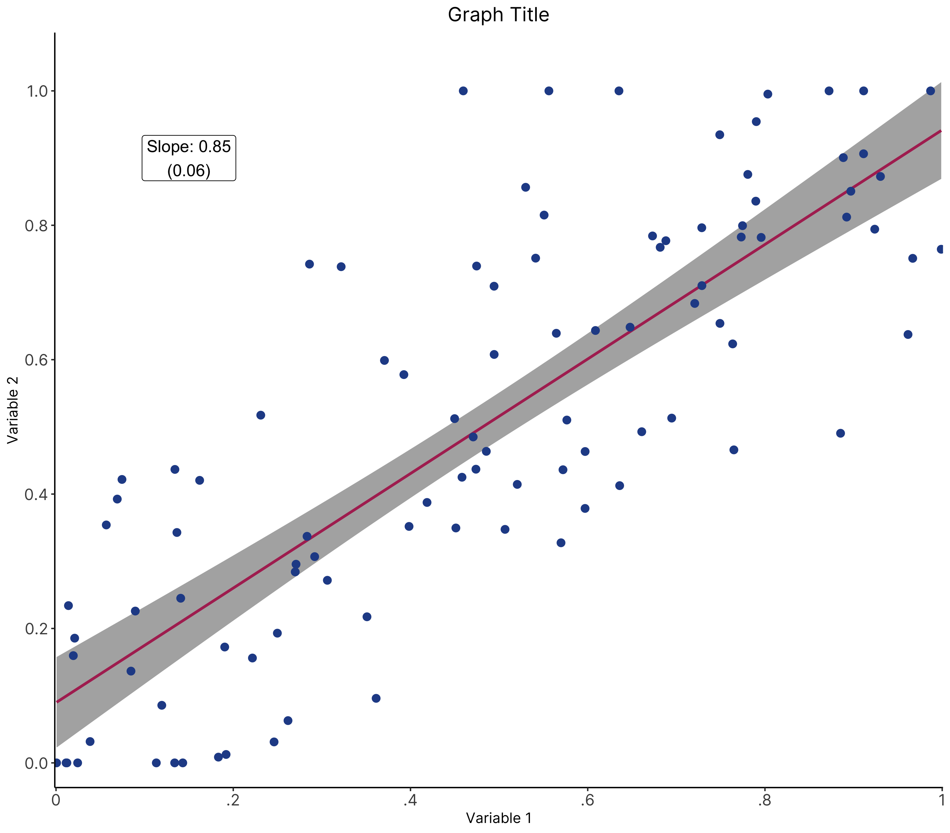
The chart
Stata

R

The R graph looks different since it has been created using a different dataset.
Data
Dataset used to create the R version of the graph can be found here.
The code
Stata
* Create fake dataset (delete this section and import your own data)
clear
set obs 100
gen x_var = runiform()
gen y_var = x_var+rnormal(0,0.2)
replace y_var = 0 if y_var < 0
replace y_var = 1 if y_var > 1

* Enter your relevant variable names here
local xvar x_var
local yvar y_var

* Change the graph font here if you want
// graph set window fontface "Times New Roman"

* Save coefficient & SE on total_bl_villavg
reg `yvar' `xvar', robust
local coef = _b[`xvar']
local coef: disp %3.2f `coef'
local se = _se[`xvar']
local se: disp %3.2f `se'

* Graph
twoway (lfitci `yvar' `xvar', clcolor(maroon) level(95)) ///
	(scatter `yvar' `xvar') ///
	, ///
	text(0.9 0.2 "Slope:`coef'" "(`se')", box fcolor(none) lcolor(black) size(medlarge) margin(small)) ///
	xlabel(0(0.2)1) ///
	xtitle("Variable 1") ///
	ylabel(0(0.2)1, format(%3.1f) angle(horizontal)) ///
	yscale(range(0 1.1)) ///
	ytitle("Variable 2") ///
	title("Graph Title") ///
	legend(off) ///
	scheme(s1color) ///
	plotregion(margin(zero) style(none))
graph export "Scatterplot with fitted line graph.png", replace
R
# Fitted line with scatter and beta
################################ Initial Setup #################################
# Install required packages if they are not already in your system
packages <- c( 'tidyverse', 'MASS')

lapply(packages, function(i) {if(!i %in% installed.packages() == T)
{install.packages(i, dependencies = TRUE, repos='http://cran.rstudio.com/')}})

# Loading required packages
library("tidyverse")
library("MASS")

# Setting working directory
setwd("~/Dropbox (IDinsight)/Data visualization library")

################################ Loading dataset ###############################
# Loading dummy dataset created using the Stata code
mydata <- read_csv("Data/line2.csv", show_col_types = FALSE)

################################ Data processing ###############################
# Running regression to store the beta coefficient and SE
# rlm indicates that it is a robust regression. The command is available to us
# from the MASS package
model <- rlm(y_var ~ x_var, data = mydata)
model_summary <- summary(model)

# Storing the slope
slope <- round(model_summary$coefficients[2,1], 2)

# Storing the SE
se <- round(model_summary$coefficients[2,2], 2)

########################################## Creating the graph ##########################################
plot <- mydata %>%

  # Setting aesthetic which will be inherited by other geometric objects
  ggplot(aes(x = x_var, y = y_var)) +

  # Creating the fitted line.
  # This geometric object is created before the points since we want the points
  # to appear on top of the fitted line
  geom_smooth(method = rlm, color = "maroon", formula = y ~ x,
              fill = "grey10") +

  # Creating the points
  geom_point(color = "#264D96", size = 2.5) +

  # Creating the box with the slope and standard error
  # \n indicates new line
  annotate(geom = "label", x = 0.15, y = 0.9,
           label = paste0("Slope: ", slope, "\n(", se, ")"),
           size = 4.5) +

  # Customizing the y-axis
  # Limits determine the extent of the axis
  # Breaks determine the axis ticks
  # Expand determine the gap between the axis and the data. Here, we are using
  # (0.035, 0), which puts some space below the 0 on the y-axis
  scale_y_continuous(expand = c(0.035, 0),
                     limits = c(0, 1.05),
                     breaks = c(seq(from = 0, to = 1, by = 0.2))) +

  # Customizing the x-axis
  # Limits determine the extent of the axis
  # Breaks determine the axis ticks
  # Expand determines the gap between the axis and the data. Here, we are using
  # (0, 0.002), which puts some space to the left of the 0 on the x-axis
  # Labels is used to customize the labels
  scale_x_continuous(expand = c(0, 0.002),
                     breaks = c(seq(from = 0, to = 1, by = 0.2)),
                     labels = c("0", ".2", ".4", ".6", ".8", "1")) +

  # Graph, x-axis and y-axis titles
  labs(x = "Variable 1",
       y = "Variable 2",
       title = "Graph Title")

########################################## Formatting the graph ##########################################
plot +
  theme_classic() +
  # The following visual elements have been modified:
    # Changed the font face to Inter
    # Removed the legend title
    # Changed the legend position
    # Changed the color of the legend box border to black
    # Changed the size of the axis text
    # Center aligned and changed the size of the graph title
  theme(text = element_text(family = "Inter"),
        axis.text = element_text(size = 12),
        plot.title = element_text(hjust = 0.5, size = 15))

########################################## Saving and exporting ##########################################
#indicating the export folder and the image file name
export_folder <- "R/Line graphs/Exports/"
img_name <- "scatter_fitted_line_R_reviewed.png"
ggsave(paste(export_folder, img_name,sep = ""))
Other details
R
A step-by-step guide on how to produce this graph can be found here.
Code written by Arkadeep Bandyopadhyay and reviewed by Sandra Alemayehu. Colors for the graph have been chosen from IDinsight’s brand guide.