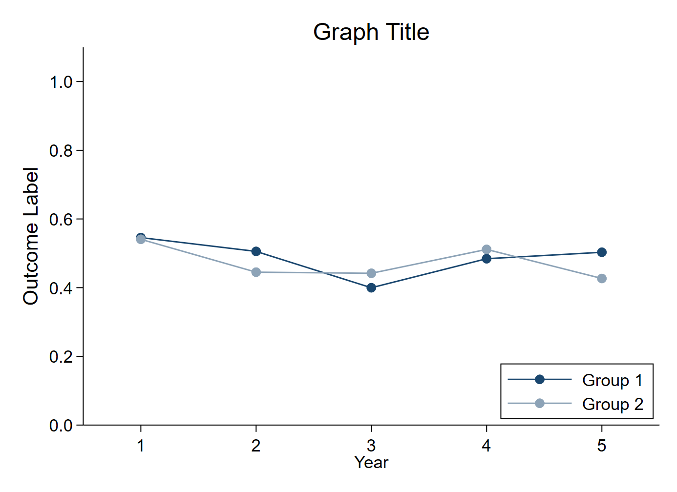
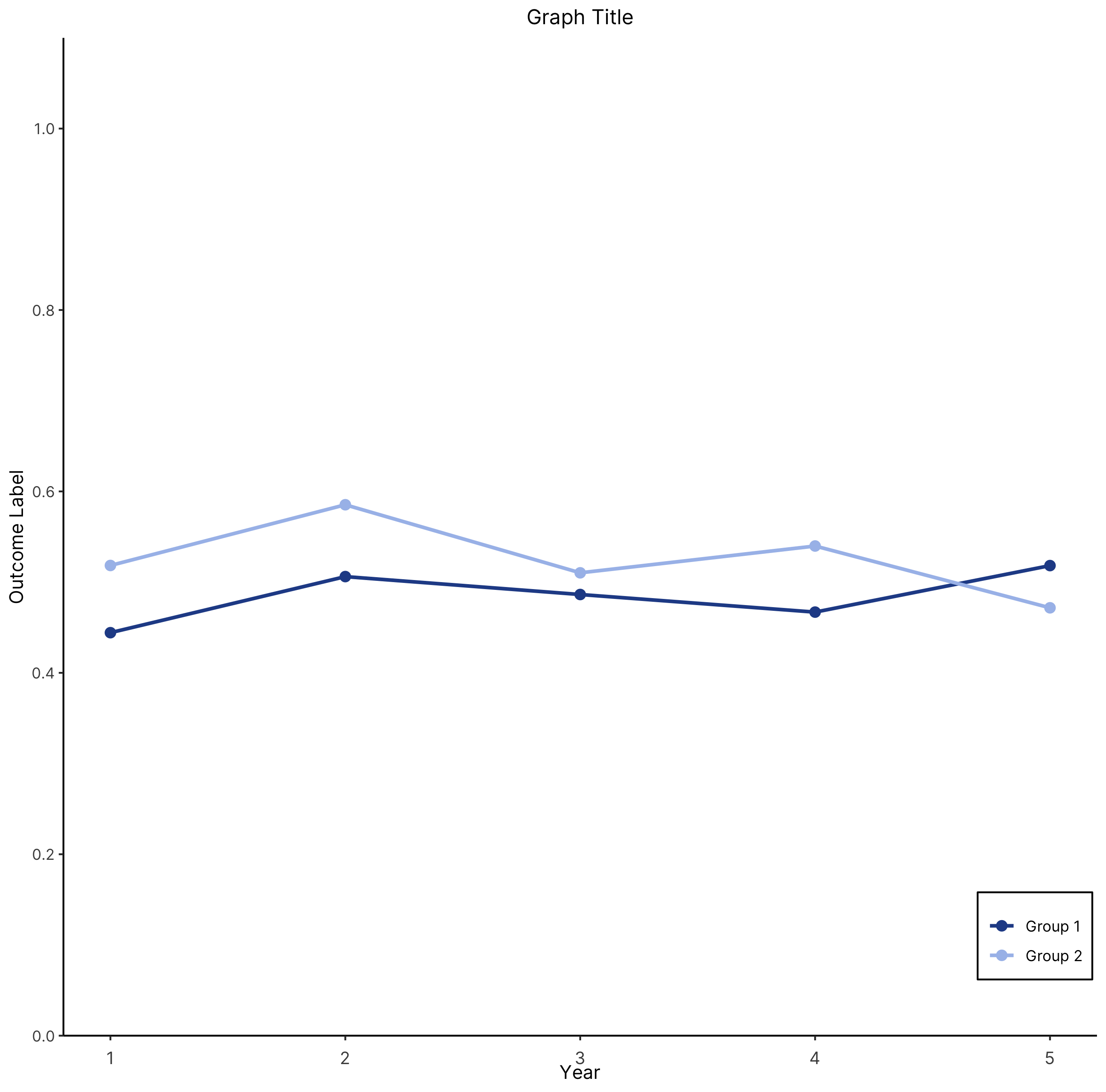
The chart
Stata

R

The R graph looks different since it has been created using a different dataset.
Data
Dataset used to create the R version of the graph can be found here.
The code
Stata
* Create fake dataset (delete this section and import your own data)
// Note that data should be in 'long' form
clear
set obs 500
gen outcome_var = runiform()
gen group_var = (_n > 0.5*_N)
gen year_var = 1
forval y=2/5{
	local z = `y'-1
	bys group_var: replace year_var = `y' if _n >= `z'*_N/5
}

* Enter your relevant variable names here
local outcome outcome_var
local group group_var
local year year_var

* Change the graph font here if you want
// graph set window fontface "Times New Roman"

* Collapse data to group-year level
collapse (mean) `outcome', by(`group' `year')

* Connected line graph
twoway 	(connected `outcome' `year' if `group' == 0, color(navy)) ///
		(connected `outcome' `year' if `group' == 1, color(navy*0.5)) ///
		, ///
		xtitle("Year") ///
		xscale(range(0.5 5.5)) ///
		ylabel(0(0.2)1, format(%3.1f) angle(horizontal)) ///
		yscale(range(0 1.1)) ///
		ytitle("Outcome Label", size(medlarge)) ///
		title("Graph Title") ///
		legend(order(1 "Group 1" 2 "Group 2") rows(2) ring(0) position(5)) ///
		scheme(s1color) ///
		plotregion(margin(zero) style(none))
graph export "Connected line graph.png", replace
R
# Scatter + connected lines
# Two groups

############################### Initial Setup ##################################
# Install required packages if they are not already in your system
packages <- c('tidyverse')

lapply(packages, function(i) {if(!i %in% installed.packages() == T)
{install.packages(i, dependencies = TRUE, repos='http://cran.rstudio.com/')}})

# Loading required packages
library("tidyverse")

# Setting working directory
setwd("~/Dropbox (IDinsight)/Data visualization library")


################################ Loading dataset ###############################
# Loading dummy dataset created using the Stata code
# Data has to be in long format
mydata <- read_csv("Data/line1.csv", show_col_types = FALSE)


############################# Data processing ##################################
data_process <- mydata %>%
  group_by(group_var, year_var) %>%
  summarise(mean = mean(outcome_var))

# Converting the group_var into a factor
data_process$group_var <- as.factor(data_process$group_var)


############################# Creating the graph ###############################
plot <- data_process %>%

  # Setting aesthetic which will be inherited by other geometric objects
  ggplot(aes(x = year_var, y = mean, group = group_var)) +

  # Creating the points where the color is set according to the group_var
  geom_point(aes(color = group_var), size = 2.5) +

  # Creating the lines where the color is set according to the group_var
  geom_line(aes(color = group_var), size = 1) +

  # Setting the color and label for the legend
  scale_color_manual(values = c("#264D96", "#A8BFEB"),
                     labels = c("Group 1", "Group 2")) +

  # Customizing the y-axis.
  # Limits determine the extent of the axis.
  # Breaks determine the axis ticks
  # Expand with (0, 0) removes the space between the axis and the data
  scale_y_continuous(expand = c(0, 0),
                     limits = c(0, 1.1),
                     breaks = c(seq(from = 0, to = 1, by = 0.2))) +

  # Adding the graph and axis titles
  labs(title = "Graph Title",
       y = "Outcome Label",
       x = "Year")

############################ Formatting the graph ##############################
plot +
  theme_classic() +
  # The following visual elements have been modified:
    # Overall font has been changed to Inter
    # Legend title has been removed
    # Legend was positioned at (0.94, 0.10)
    # Legend box boundary color is set as black
    # x-axis text is vertically aligned and resized
    # The graph title is center aligned and resized
  theme(text = element_text(family = "Inter"),
        legend.title = element_blank(),
        legend.position = c(0.94, 0.10),
        legend.background = element_rect(colour = "black"),
        axis.text.x = element_text(vjust = -1, size = 10),
        plot.title = element_text(hjust = 0.5, size = 12))


############################ Saving and exporting ##############################
#indicating the export folder and the image file name
export_folder <- "R/Line graphs/Exports/"
img_name <- "scatter_connected_R_reviewed.png"
ggsave(paste(export_folder, img_name,sep = ""))
Other details
R
Code written by Arkadeep Bandyopadhyay and reviewed by Sandra Alemayehu. Colors for the graph have been chosen from IDinsight’s brand guide.