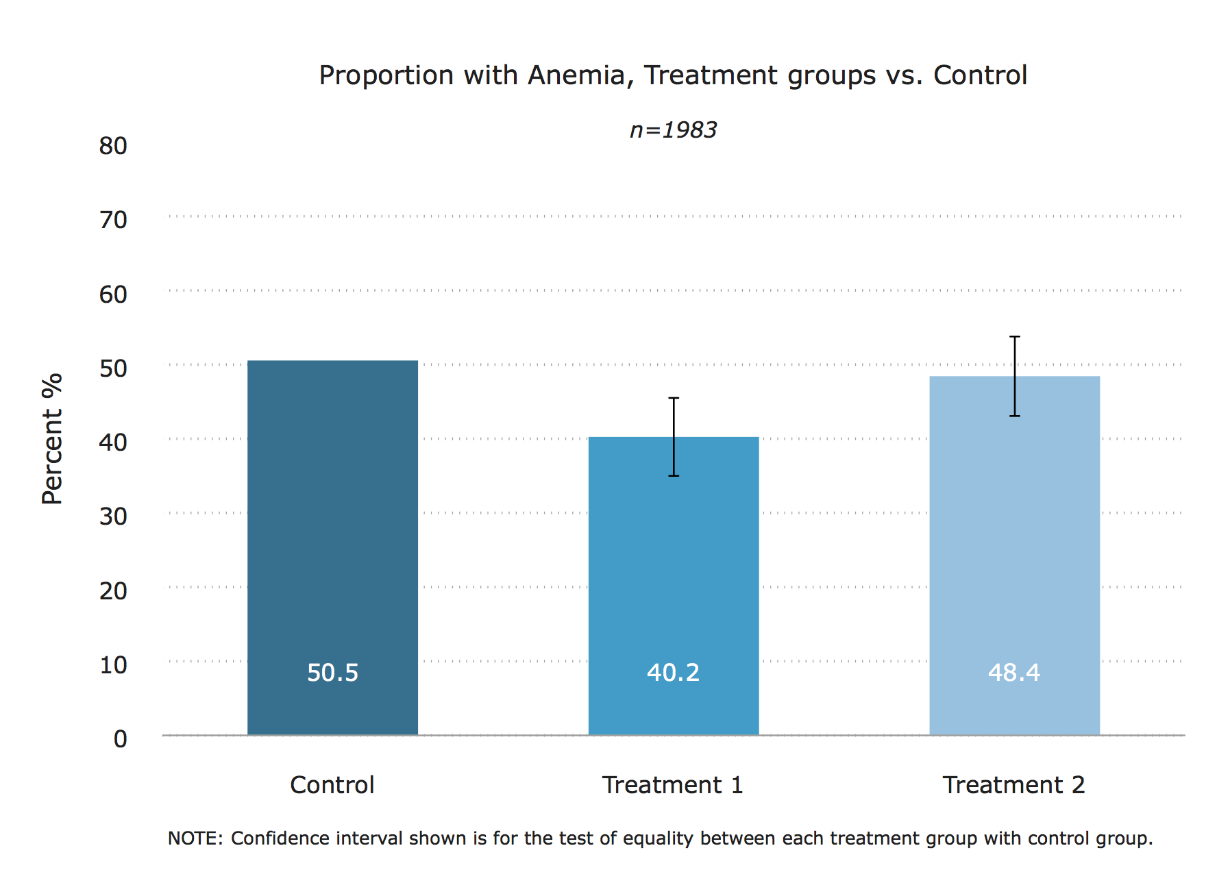
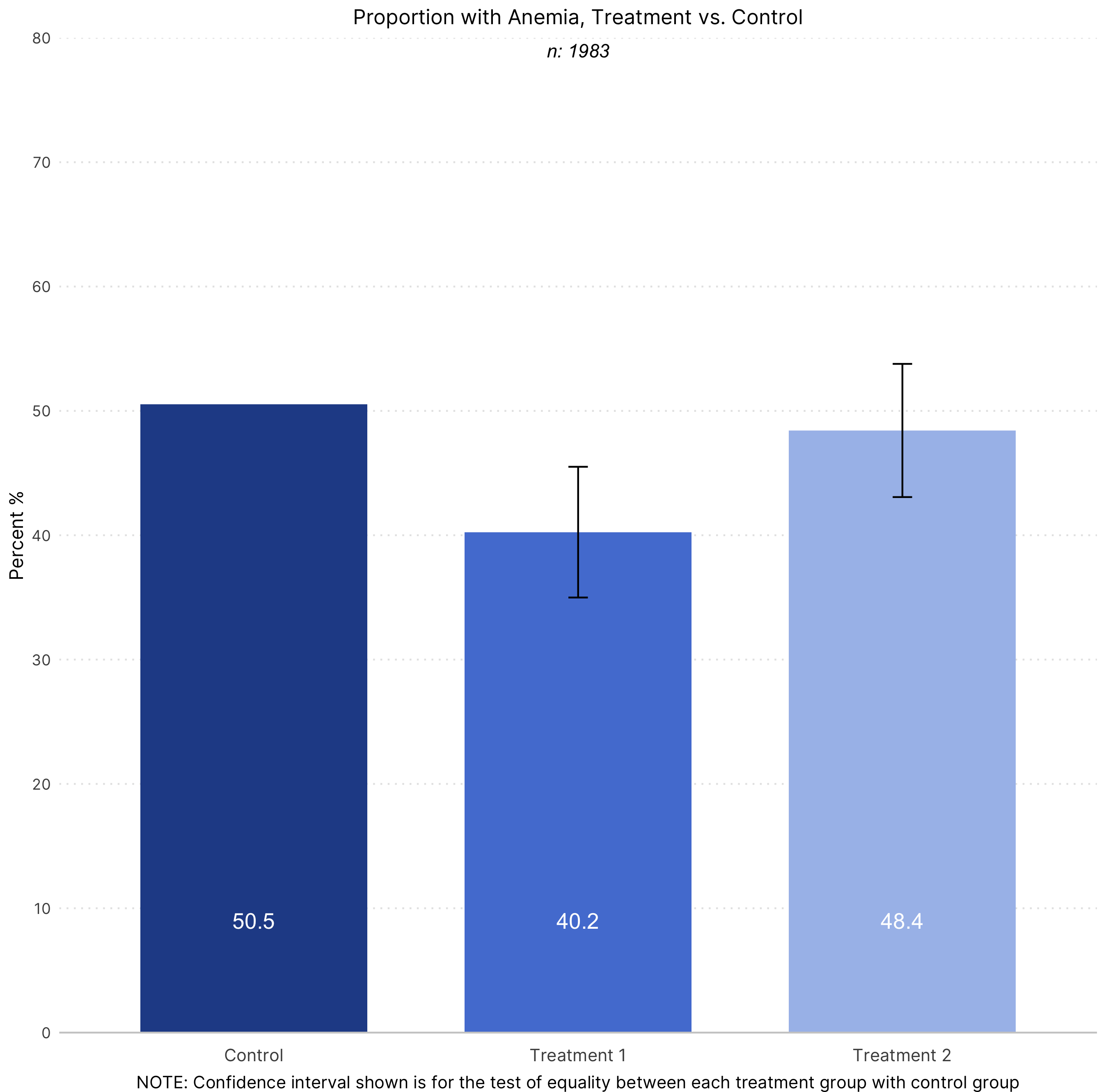
The chart
Stata

R

Data
Sample dataset in .dta format can be downloaded here. The R code uses the same dataset in .csv format, which can be found here.
The code
Stata
*_______________________________________________________________________________

* Project       : IDinsight data visualization guide - Stata graph templates
*
* Graph Type    : Treatment vs. control bar graphs w/ confidence interval
*                 for the treatment effect (TYPE 2)

*                 Figure displays control and treatment group means +
*                 confidence interval for the test of equality between each
*                 treatment group & control.

* By            : Crystal Huang
* Last edited   : May 23, 2019
*_______________________________________________________________________________


* Toy dataset

global data "/Users/crystalhuang/Dropbox (IDinsight)/Data Visualization Guide/3. Toy Data"
global output "/Users/crystalhuang/Dropbox (IDinsight)/Data Visualization Guide/2. Graph templates/graphs"

use "$data/toydata.dta", clear

* Set IDinsight scheme and font

set scheme idinsight
graph set window fontface "Verdana"


* 1. Run regression to get treatment effects for T1 and T2

    reg anemic treat1 treat2

* 2. Store output in matrix- sample size for the graph later

    mat A = r(table)
    local samp = e(N)

* 3. Store regression results we need in matrices (to be later made into a dataset)

    matlist A

    * a) Estimated Treatment 1 mean (T1 effect + _cons) and CI of treatment effect

        local mean_t1= A[1,1] + A[1,3]
        local se_t1 = A[2,1]

        mat T1= [`mean_t1', `se_t1']
        mat rownames T1 = "treatment 1"

    * b) Estimated Treatment 2 mean (T2 effect + _cons) and CI of treatment effect

        local mean_t2 = A[1,2] + A[1,3]
        local se_t2 = A[2,2]
        mat T2 = [`mean_t2',`se_t2']
        mat rownames T2 = "treatment 2"

    * c) Adjusted Control mean (coefficient on _cons)

        local c= A[1,3]
        mat C= [`c',.]
        matlist C
        mat rownames C= "control"

    * d) Vertically combine the matrices of results

        mat result= T1\T2\C
        mat colnames result = "mean" "se"

*4. Save matrix into a new dataset

    clear
    qui svmat result, names(col)

    g treat= 1 in 1
    replace treat= 2 in 2
    replace treat= 0 in 3

    * create CIs for treatment groups

    g lo =  mean + 1.96*se
    g hi =  mean - 1.96*se

*5. Format bar labels into percentages with 1 decimal place

    foreach var in mean hi lo {
    replace `var'= `var'*100
    }

    format mean %4.1f

*6. Create x-axis variable "x" that contains the order of bars that will appear in your plot

    sort treat
    g x= _n

    * Create y-axis variable that contains y-placement for bar labels
    g y= 2

    #delimit;
    twoway (bar mean x if treat==0, barwidth(0.5))
           (bar mean x if treat==1, barwidth(0.5))
           (bar mean x if treat==2, barwidth(0.5))
           (rcap hi lo x, lwidth(thin) lcolor(black))
           (scatter y x, msym(none) mlab(mean) mlabpos(12) mlabgap(4) mlabsize(small) mlabcolor(white)),
           ylab(0(10)80, format(%4.0f))
           xlab(0.5 " " 1 "Control" 2 "Treatment 1" 3 "Treatment 2" 3.5 " ", nogrid)
           xtitle("")
           ytitle("Percent %")
           yscale(lcolor(white))
           title("Proportion with Anemia, Treatment groups vs. Control")
           subtitle("{it}n=`samp'{sf}")
           caption("NOTE: Confidence interval shown is for the test of equality between each treatment group with control group.")
           legend(off);
    graph export "$output/bar_TvsC_type2.tif", replace ;

    #delimit cr
R
# Treat/control V2

############################### Initial Setup ###################################
# Install required packages if they are not already in your system
packages <- c('readr',
              'tidyverse')

lapply(packages, function(i) {if(!i %in% installed.packages() == T)
{install.packages(i, dependencies = TRUE, repos='http://cran.rstudio.com/')}})

# Loading required packages
library("readr")
library("tidyverse")

# Setting working directory
setwd("~/Dropbox (IDinsight)/Data visualization library")


################################ Loading dataset ###############################

mydata <- read_csv("Data/toydata.csv", show_col_types = FALSE)


############################### Data processing ################################
# Setting the right data type
# Converting the treatment variables to a factor variables
# This is because treatment will appear on the x-axis and it has only 2
# values (discrete)
mydata$treat1 <- as.factor(mydata$treat1)
mydata$treat2 <- as.factor(mydata$treat2)

# Getting the treatment effects

model <- lm(anemic ~ treat1 + treat2, data = mydata)
model_summary <- summary(model)
model_confint <- confint(model)

# Storing the sample size
samp <- nobs(model)

# Estimated Treatment 1 mean (T1 effect + intercept)
mean_t1 <- model_summary$coefficients[1, 1] + model_summary$coefficients[2, 1]
se_t1 <- model_summary$coefficients[2, 2]

# Estimate Treatment 2 mean (T2 effect + intercept)
mean_t2 <- model_summary$coefficients[1, 1] + model_summary$coefficients[3, 1]
se_t2 <- model_summary$coefficients[3, 2]

# Adjusted control mean (coefficient on intercept)
mean_control <- model_summary$coefficients[1, 1]

# Combining to a single data frame
means <- rbind(mean_t1, mean_t2, mean_control)
ses <- rbind(se_t1, se_t2, NA)
status <- c(1, 2, 0)

graph_data <- as.data.frame(cbind(status, means, ses))
rownames(graph_data) <- NULL
colnames(graph_data) <- c("treat", "mean", "se")
graph_data$treat <- as.factor(graph_data$treat)

################################ Creating the graph ############################
# Define axis and fill variable
x_values <- graph_data$treat
y_values <- graph_data$mean

plot <- graph_data %>%

  # Setting aesthetic which will be inherited by other geometric objects
  ggplot(aes(x = x_values, y = y_values)) +

  # "identity" selected for stat since we want the heights of the bars to
  # represent values in the data. The default, "bin" makes the height of each
  # bar equal to the number of cases in each group.
  # Fill is set according to the treatment status
  # Width determines the width of the bars
  geom_bar(aes(fill = treat), stat = "identity", width = 0.7) +

  # Creates the error bars on top of the bars
  geom_errorbar(aes(ymin = (y_values - 1.96*se), ymax = (y_values + 1.96*se)),
                width = 0.06,
                size = 0.5) +

  # Creates the mean text on top of the error bars. It is position at y = 0.09
  # units. This puts it inside the bar
  geom_text(aes(y = 0.09, label = round(y_values*100, 1)), color = "white",
            size = 4.5) +

  # Creates the text with the n
  annotate(geom = "text", y = 0.79, x = 2,
           label = paste0("n: ", samp),
           fontface = "italic") +

  # Choosing the bar colors from IDinsight brand colors
  scale_fill_manual(values = c("#264D96", "#5480D6", "#A8BFEB")) +

  # Expand with (0, 0) removes the space between the axis and the plot.
  # Limits determine the extent of the y-axis
  # Breaks determine the axis ticks
  # Labels determine what is displayed at each tick
  scale_y_continuous(expand = c(0, 0),
                     limits = c(0, 0.8),
                     breaks = c(seq(from = 0, to = 0.8, by = 0.1)),
                     labels = c("0", "10", "20", "30", "40", "50",
                                "60", "70", "80")) +

  # Setting the x-axis labels
  scale_x_discrete(breaks = c(0, 1, 2),
                   labels = c("Control", "Treatment 1", "Treatment 2")) +

  # Graph, axis title and caption labels
  labs(title = "Proportion with Anemia, Treatment vs. Control",
       y = "Percent %",
       caption = "NOTE: Confidence interval shown is for the test of equality between each treatment group with control group")

############################# Formatting the graph #############################
plot +
  theme_classic() +
  # The following visual elements have been modified:
  # Set the overall font as Inter
  # Removed the x-axis title
  # Set the x-axis line as a light shade of gray
  # Removed the y-axis line
  # Create y-axis grid lines which are light gray and dotted
  # Removed axis ticks
  # Removed the legend
  # Vertically aligned and resized the x-axis text
  # Horizontally and vertically aligned and resized the caption
  # Horizontally aligned and resized the graph title
theme(text = element_text(family = "Inter"),
      axis.title.x = element_blank(),
      axis.line.x = element_line(color = "grey80"),
      axis.line.y = element_blank(),
      panel.grid.major.y = element_line(colour = "grey90", linetype = "dotted"),
      axis.ticks = element_blank(),
      legend.position = "none",
      axis.text.x = element_text(vjust = -1, size = 10),
      plot.caption = element_text(hjust = 0.5, vjust = -3, size = 10),
      plot.title = element_text(hjust = 0.5, size = 12))

############################# Saving and exporting #############################
#indicating the export folder and the image file name
export_folder <- "R/Bar graphs/Exports/"
img_name <- "bar_treat_control_v2_R_reviewed.png"
ggsave(paste(export_folder,img_name,sep = ""))
Other details
Stata
Credit: Crystal Huang
You must have IDinsight styles installed to get replicate the chart above.
R
Code written by Arkadeep Bandyopadhyay and reviewed by Sandra Alemayehu.
Colors for the graph have been chosen from IDinsight’s brand guide.