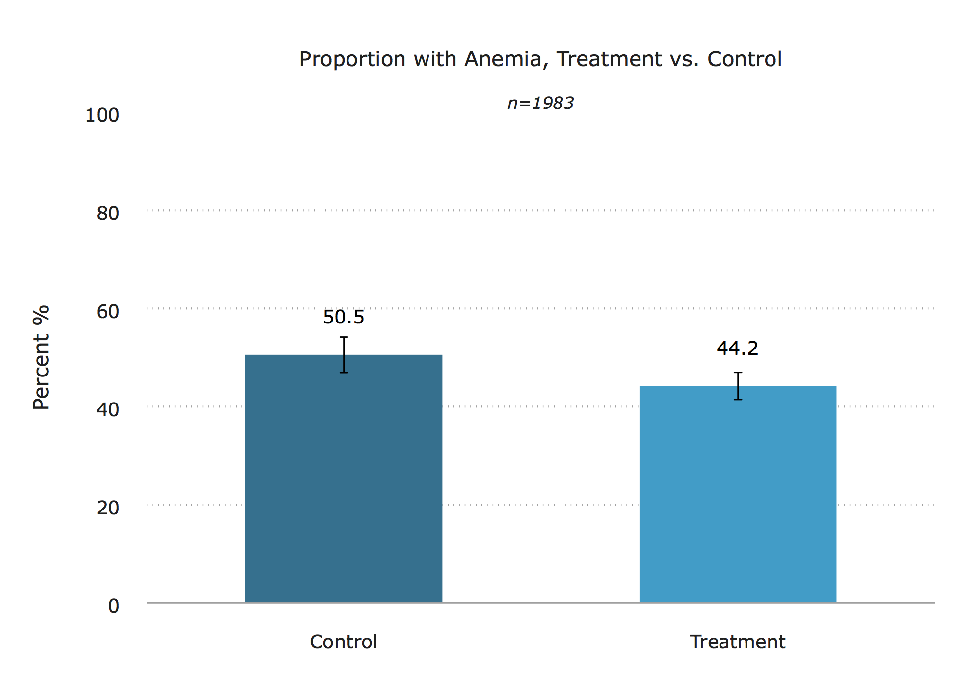
Note that there are two code snippets below. They generate charts that have the same visuals but use different analysis. The first one does not adjust for any covariates while the second one does.
The chart

Data
Sample dataset can be downloaded here
The code
Raw means
Not adjusting for any covariates
*_______________________________________________________________________________

* Project     : IDinsight data visualization guide - Stata graph templates
*
* Graph Type  : Treatment vs. control bar graphs w/ confidence intervals (TYPE 1)
*                   Graph 1. Raw means
*                   Graph 2. Covariate-adjusted means from regression

* By          : Crystal Huang
* Last edited : April 15, 2019
*_______________________________________________________________________________

* Toy dataset

global data "/Users/crystalhuang/Dropbox (IDinsight)/Data Visualization Guide/3. Toy Data"
global output "/Users/crystalhuang/Dropbox (IDinsight)/Data Visualization Guide/2. Graph templates/graphs"

use "$data/toydata.dta", clear

* Set IDinsight scheme and font

set scheme idinsight
graph set window fontface "Verdana"

**************************************************************

* Plotting treatment and control means

**************************************************************

*1. Get standard errors, upper and lower CIs

    g se= .
    g lo= .
    g hi= .

    forval i= 0/1 {
        mean anemic if anytreat== `i'

        mat A = r(table)
        local se_`i' = A[2,1]
        local lo_`i' = A[5,1]
        local hi_`i' = A[6,1]

        replace se= `se_`i'' if anytreat== `i'
        replace lo= `lo_`i'' if anytreat== `i'
        replace hi= `hi_`i'' if anytreat== `i'
    }

*2. Get sample size for graph subtitle

    mean anemic
    local samp = e(N)

*3. Collapse to get height of each bar (outcome variable mean) by treatment status

    collapse (mean) mean=anemic (first) se hi lo, by(anytreat)

*4. Format bar labels into percentages with 1 decimal place

    foreach var in mean se hi lo {
    replace `var'= `var'*100
    }

    format mean %4.1f

*5. Create x-axis variable "x" that contains the order of bars that will appear in your plot

    sort anytreat
    g x= _n

    #delimit;
    twoway  (bar mean x if anytreat== 0, barwidth(0.5))
            (bar mean x if anytreat== 1, barwidth(0.5))
            (rcap hi lo x, lwidth(thin) lcolor(black))
            (scatter mean x, msym(none) mlab(mean) mlabpos(12) mlabgap(4) mlabsize(small) mlabcolor(black)),
            ylab(0(20)100, format(%4.0f))
            xlab(0.5 " " 1 "Control" 2 "Treatment" 2.5 " ", nogrid)
            xtitle("")
            ytitle("Percent %")
            yscale(lcolor(white))
            title("Proportion with Anemia, Treatment vs. Control")
            subtitle("{it}n=`samp'{sf}")
            legend(off);

    graph export "$output/bar_TvsC.tif", replace ;
    #delimit cr
Covariate-adjusted means
Using a regression to adjust the means
* Toy dataset

global data "/Users/crystalhuang/Dropbox (IDinsight)/Data Visualization Guide/3. Toy Data"
global output "/Users/crystalhuang/Dropbox (IDinsight)/Data Visualization Guide/2. Graph templates/graphs"

use "$data/toydata.dta", clear

* Set IDinsight scheme and font

set scheme idinsight
graph set window fontface "Verdana"


************************************************************************

* Graph   - Plotting treatment and control adjusted means from regression output
* 		  - Note if you reg y x without covariates, this gets you the same thing
*		    as above
************************************************************************

use "$data/toydata.dta", clear

* 1. Run regression

    reg anemic i.anytreat female age i.region overweight

* 2. Store pval and sample size in locals for the graph later

    mat results = r(table)
    local samp = e(N)
    local pval = results[4,2]

*3. Run margins post-estimation command to get adjusted means and CIs

    margins anytreat
    mat A = r(table)

    * store control group means and CIs
        local b = A[1,1]
        local lo = A[5,1]
        local hi = A[6,1]
        mat C = [`b',`lo',`hi']
        mat rownames C= "control"

    * store treatment means and CIs
        local b = A[1,2]
        local lo= A[5,2]
        local hi = A[6,2]
        mat T = [`b',`lo',`hi']
        mat rownames T = "treatment"

    * combine
        mat result= C\T
        mat colnames result = "mean" "lo" "hi"
        qui matlist result

*4. Save matrix into a new dataset

    clear
    qui svmat result, names(col)

    g anytreat= "Control" in 1
    replace anytreat= "Treatment" in 2

*5. Format bar labels into percentages with 1 decimal place

    foreach var in mean hi lo {
    replace `var'= `var'*100
    }

    format mean %4.1f

*6. Create x-axis variable "x" that contains the order of bars that will appear in your plot

    sort anytreat
    g x= _n

    #delimit;
    twoway  (bar mean x if anytreat== "Control", barwidth(0.5))
            (bar mean x if anytreat== "Treatment", barwidth(0.5))
            (rcap hi lo x, lwidth(thin) lcolor(black))
            (scatter mean x, msym(none) mlab(mean) mlabpos(12) mlabgap(4) mlabsize(small) mlabcolor(black)),
            ylab(0(20)100, format(%4.0f))
            xlab(0.5 " " 1 "Control" 2 "Treatment" 2.5 " ", nogrid)
            xtitle("")
            ytitle("Percent %")
            yscale(lcolor(white))
            title("Proportion with Anemia, Treatment vs. Control")
            subtitle("{it}n=`samp'{sf}")
            legend(off);

    graph export "$output/bar_TvsC_regadjusted.tif", replace ;
    #delimit cr
Other details
Credit: Crystal Huang
You must have IDinsight styles installed to get replicate the chart above.