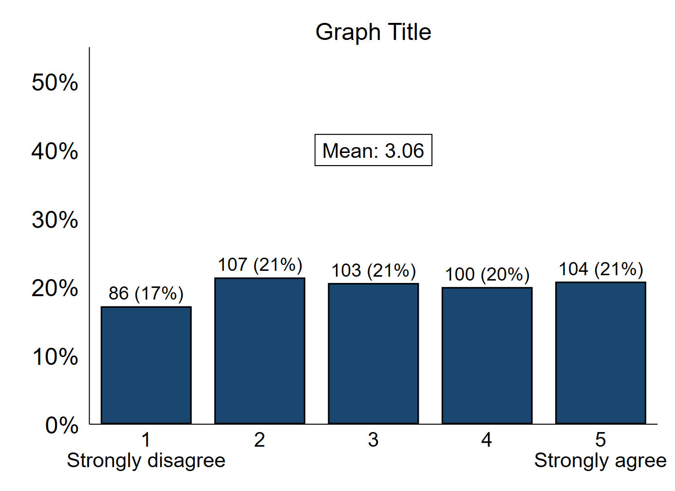
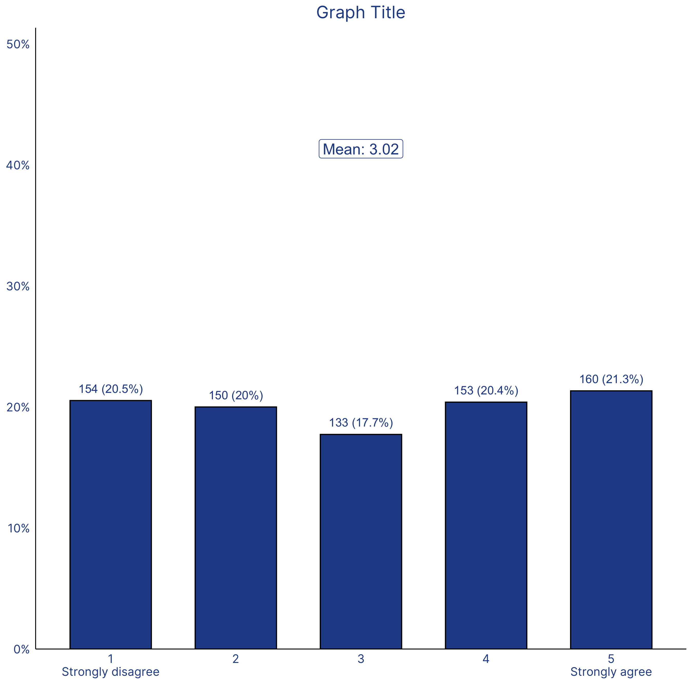
The chart
Stata

R

The code
Stata
* Create fake dataset (delete this section and import your own data)
clear
set obs 500
gen rand = runiform()
gen outcome_var = 1
forval y=2/5{
	local z = `y'-1
	replace outcome_var = `y' if rand >= `z'/5
}

* Enter your relevant variable names here
local var outcome_var

* Change the graph font here if you want
// graph set window fontface "Times New Roman"

* X-axis categories
gen scatter_x = .
replace scatter_x = _n in 1/5

* X-axis label
local xlab1 "Strongly disagree"
local xlab5 "Strongly agree"
local xlab "1 `""1" "`xlab1'""' 2 "2" 3 "3" 4 "4" 5 `""5" "`xlab5'""'"
local xrange "0.5 5.5"

* Bar labels
gen scatter_y = .
gen scatter_y_str = ""
forval i = 1/5{
	count if `var' == `i'
	local num `r(N)'
	count if !missing(`var')
	local denom `r(N)'
	local loc = 100*round(`num'/`denom', 0.001)
	replace scatter_y = `loc'  in `i'
	replace scatter_y_str = "`num' ("+strofreal(`loc',"%4.0f")+"%)" in `i'
}

* Y-axis labels
local yval 50
local ylab 0 "0%" 10 "10%" 20 "20%" 30 "30%" 40 "40%" 50 "50%"
sum scatter_y
local ymax `r(max)'
if `ymax' > 50{
	local yval = 10*ceil(`ymax'/10)
	forval i = 50(10)`yval'{
		local ylab `ylab' `i' "`i'%"
	}
}

* Overall mean caption
sum `var'
local overall_mean = `r(mean)'
local overall_mean: disp %4.2f `overall_mean'


* Likert historgram graph
twoway ///
	(histogram `var', discrete width(1) percent fcolor(navy) lcolor(black) gap(20)) ///
	(scatter scatter_y scatter_x, mlabel(scatter_y_str) msymbol(i) mlabsize(medium) mlabcolor(black) mlabposition(12)) ///
	, ///
	text(40 3 "Mean: `overall_mean'", box fcolor(none) lcolor(black) size(medlarge) margin(small)) ///
	xtitle("") xlabel(`xlab', labsize(medlarge) noticks `condition_xlab') ///
	xscale(range(0.5 5.5)) ///
	ylabel(`ylab', labsize(large) angle(horizontal) noticks labgap(2)) ///
	yscale(range(0 55)) ///
	ytitle("") ///
	title("Graph Title") ///
	scheme(s1color) ///
	legend(off) ///
	plotregion(margin(zero) style(none))
graph export "Likert histogram graph.png", replace
R
# Likert histogram

################################ Initial Setup #################################
# Install required packages if they are not already in your system
packages <- c('tidyverse')

lapply(packages, function(i) {if(!i %in% installed.packages() == T)
{install.packages(i, dependencies = TRUE, repos='http://cran.rstudio.com/')}})

# Loading required packages
library("tidyverse")

# Setting working directory
setwd("~/Dropbox (IDinsight)/Data visualization library")

################################ Loading dataset ###############################
# Generating dummy data
set.seed(1)
mydata <- as.data.frame(sample(1:5, 750, replace = T))
colnames(mydata)[1] <- "outcome_variable"

################################ Data processing ###############################

# Creating the bins for the columns
my_data_processed <- mydata %>%
  group_by(outcome_variable) %>%
  summarise(n = n()) %>%
  mutate(freq = n / sum(n) * 100)

# Storing the overall mean in a variable. This will be displayed on the plot
overall_mean <- round(mean(mydata$outcome_variable), 2)

############################## Creating the graph ##############################

x_values <- as.factor(my_data_processed$outcome_variable)
y_values <- my_data_processed$freq
annotate_value <- overall_mean

plot <- my_data_processed %>%

  # Setting aesthetic which will be inherited by other geometric objects
  ggplot(aes(x = x_values, y = y_values)) +

  # "identity" selected for stat since we want the heights of the bars to
  # represent values in the data. The default, "bin" makes the height of each
  # bar equal to the number of cases in each group.
  # fill (color inside that bar) is set to the IDinsight brand color
  # color (bar outline) is set as black
  geom_bar(stat = "identity", width = 0.65, fill = "#264D96",
           color = "black") +

  # Changing the x-axis label for the 1st and 5th bars
  # \n is the new line character
  scale_x_discrete(labels = c("1" = "1\nStrongly disagree",
                              "5" = "5\nStrongly agree")) +

  # Changing the y-axis labels to include the percentage sign (%)
  # Breaks determine the label ticks
  # Limit determines the length of the y-axis
  # Expand with (0, 0) removes space between the y-axis and the data.
  scale_y_continuous(expand = c(0,0),
                     limits = c(0, max(y_values) + 30),
                     breaks = c(seq(0, 50, by = 10)),
                     labels = c("0%", "10%", "20%", "30%", "40%", "50%")) +

  # The mean is displayed 1 unit above the frequency to keep space on top of the
  # bars.
  # The label which show the count and then the percentage is created using the
  # paste0 function. The label is then formatted to be in the IDinsight brand
  # color.
  geom_text(aes(y = y_values + 1, label = paste0(n, " (", round(y_values, 1), "%)")),
            color = "#264D96") +

  # This creates the box with the overall mean.
  annotate(geom = "label", x = 3, y = max(y_values) + 20,
           label = paste0("Mean: ", annotate_value),
           size = 5,
           color = "#264D96") +

  # Graph title
  labs(title = "Graph Title")

############################# Formatting the graph #############################
plot +
  theme_classic() +
  # The following visual elements have been changed:
    # Changed the overall font to Inter
    # Removed axis titles
    # Resized and changed the color of the axis text
    # Removed axis ticks
    # Changed the size of the axis line
    # Centered and changed the color of the plot title
  theme(text = element_text(family = "Inter"),
        axis.title = element_blank(),
        axis.text = element_text(size = 11, colour = "#264D96"),
        axis.ticks = element_blank(),
        axis.line = element_line(size = 0.4),
        plot.title = element_text(hjust = 0.5, color = "#264D96",
                                  size = 16))

############################# Saving and exporting #############################
#indicating the export folder and the image file name
export_folder <- "R/Bar graphs/Exports/"
img_name <- "histogram_likert_reviewed.png"
ggsave(paste(export_folder, img_name, sep = ""))
Other details
R
Code written by Arkadeep Bandyopadhyay and reviewed by Sandra Alemayehu.
Colors for the graph have been selected from IDinsight’s brand guide.