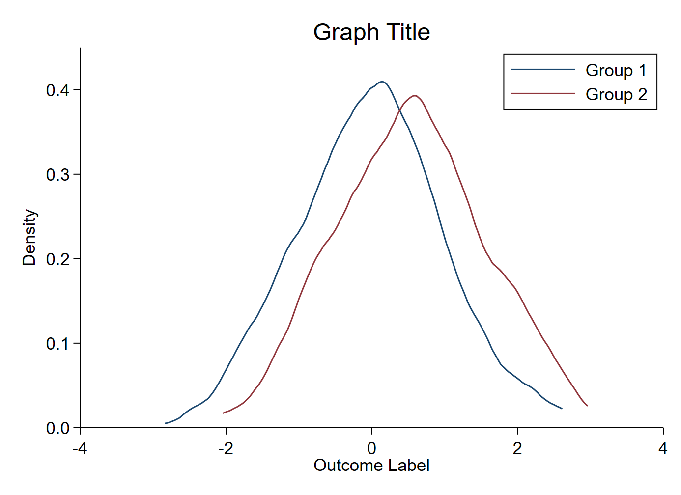
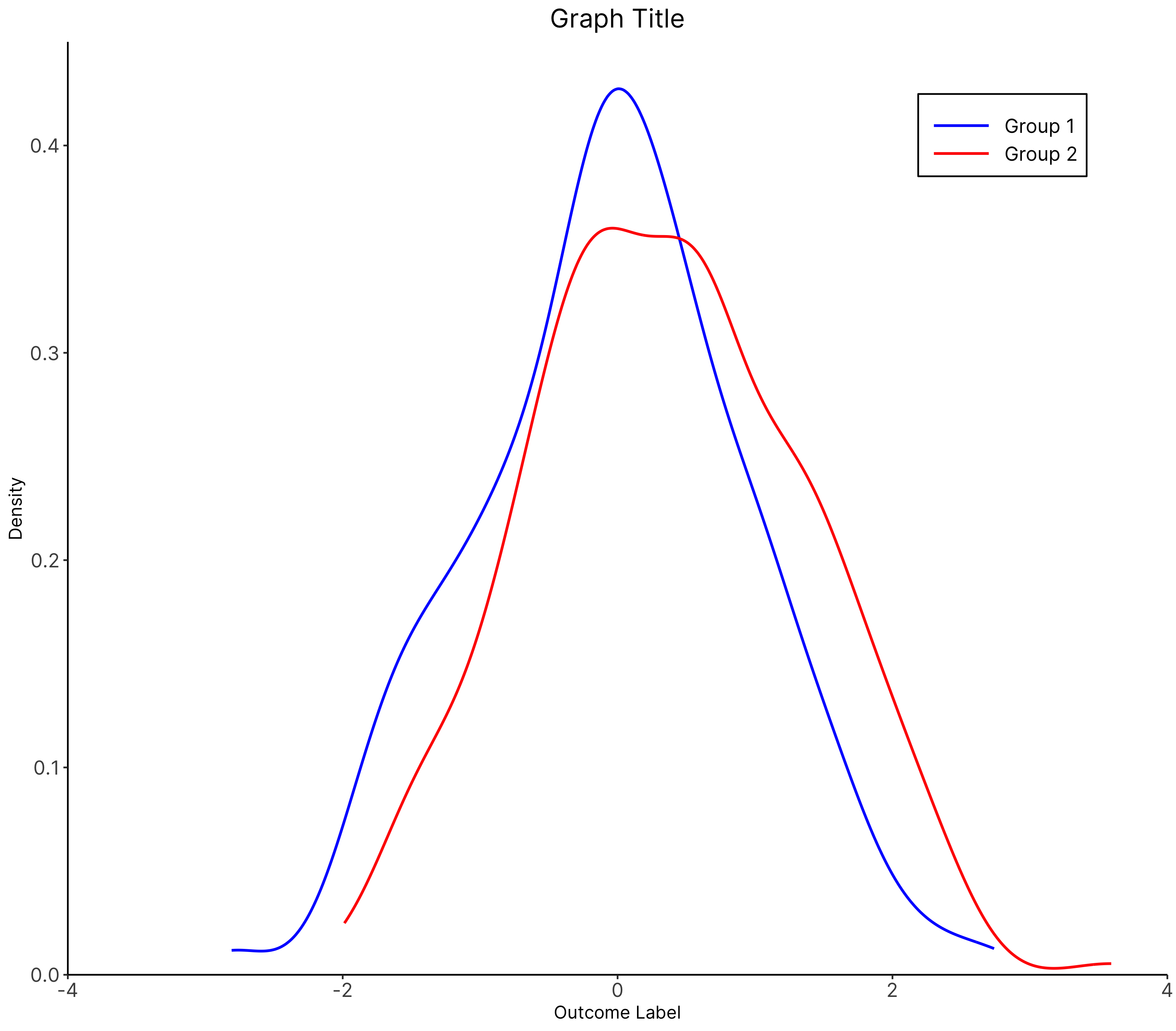
The chart
Stata

R

The R graph looks different since it has been created using a different dataset.
The code
Stata
* Create fake dataset (delete this section and import your own data)
clear
set obs 500
gen group_var = (_n > 0.5*_N)
gen outcome_var = rnormal(0) if group_var == 0
replace outcome_var = rnormal(0.5) if group_var == 1

* Enter your relevant variable names here
local outcome outcome_var
local group group_var

* Change the graph font here if you want
// graph set window fontface "Times New Roman"

* Kernel density graph
twoway 	(kdensity `outcome' if `group' == 0, color(navy)) ///
		(kdensity `outcome' if `group' == 1, color(maroon)) ///
		, ///
		xtitle("Outcome Label") ///
		ylabel(, format(%3.1f) angle(horizontal)) ///
		yscale(range(0 0.45)) ///
		ytitle("Density") ///
		title("Graph Title") ///
		legend(order(1 "Group 1" 2 "Group 2") rows(2) position(1) ring(0)) ///
		scheme(s1color) ///
		plotregion(margin(zero) style(none))
graph export "Kernel density overlapping graph.png", replace
R
# Kernel density

############################## Initial Setup ###################################
# Install required packages if they are not already in your system
packages <- c( 'tidyverse')

lapply(packages, function(i) {if(!i %in% installed.packages() == T)
{install.packages(i, dependencies = TRUE, repos='http://cran.rstudio.com/')}})


# Loading required packages
library("tidyverse")

# Setting working directory
setwd("~/Dropbox (IDinsight)/Data visualization library")

############################### Loading dataset ################################
mydata <- read_csv("Data/density.csv", show_col_types = FALSE)

################################ Data processing ###############################
mydata$group_var <- as.factor(mydata$group_var)

############################# Creating the graph ###############################
plot <- mydata %>%

  # Setting aesthetic which will be inherited by other geometric objects
  ggplot(aes(x = outcome_var, group = group_var)) +

  # color within the aesthetic function determine the color of each density
  # plot. Here we have two, Group 1 and Group 2
  stat_density(aes(color = group_var),
               geom = "line",
               position="identity", trim = TRUE,
               size = 0.8) +

  # Manually setting the colors of the two density plots
  scale_color_manual(values = c("blue", "red"),
                     labels = c("Group 1", "Group 2")) +

  # Setting the limits of the x and y axes
  scale_x_continuous(expand = c(0, 0),
                     limits = c(-4, 4)) +
  scale_y_continuous(expand = c(0, 0),
                     limits = c(0, 0.45)) +

  # Setting graph, x and y axes titles
  labs(title = "Graph Title",
       y = "Density",
       x = "Outcome Label")

plot +
  theme_classic() +
  # The following visual changes have been made:
    # Changed the font face to Inter
    # Resized the legend text
    # Increased the width of the legend key
    # Removed the legend title
    # Changed the legend position
    # Changed the color of the legend box border to black
    # Changed the size of the axis text
    # Center aligned and changed the size of the graph title
  theme(text = element_text(family = "Inter"),
        legend.text = element_text(size = 12),
        legend.key.width = unit(1.5, "cm"),
        legend.title = element_blank(),
        legend.position = c(0.85, 0.9),
        legend.background = element_rect(colour = "black"),
        axis.text = element_text(size = 12),
        plot.title = element_text(hjust = 0.5, size = 16))

############################# Saving and exporting #############################
# indicating the export folder and the image file name
export_folder <- "R/Other graphs/Exports/"
img_name <- "other_density_R.png"
ggsave(paste(export_folder,img_name,sep = ""))
Other details
R
Code written by Arkadeep Bandyopadhyay and reviewed by Sandra Alemayehu.