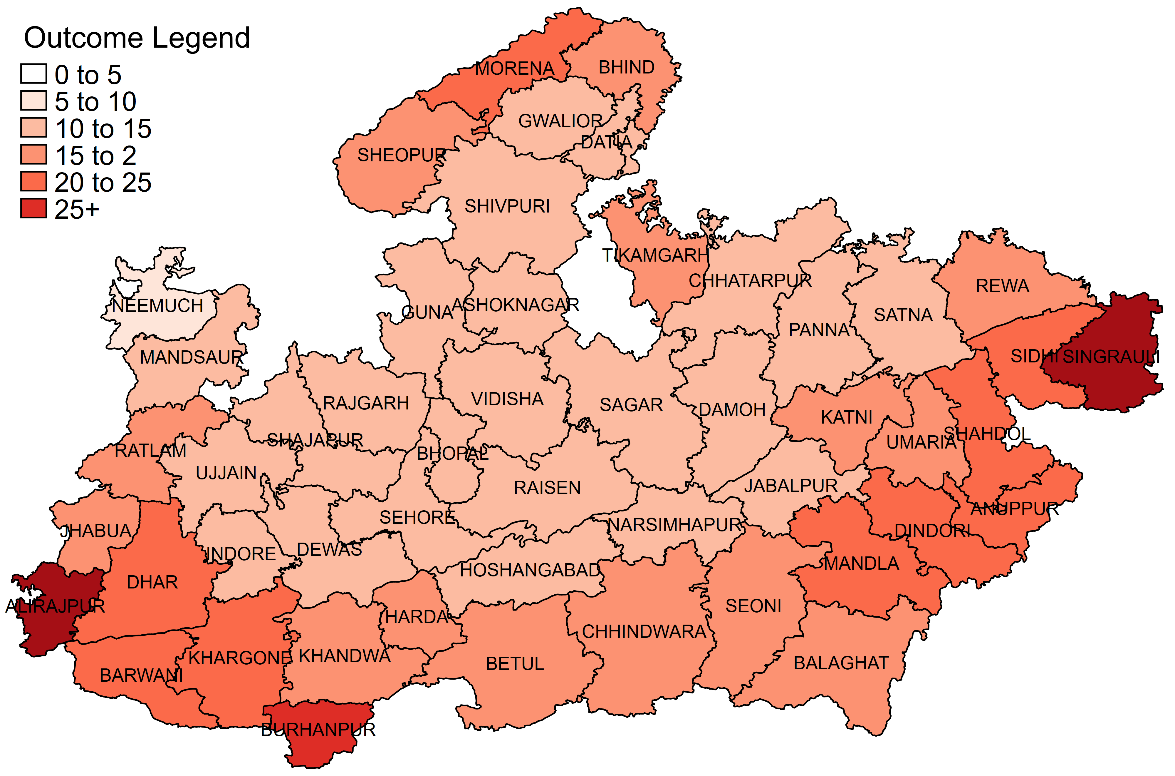
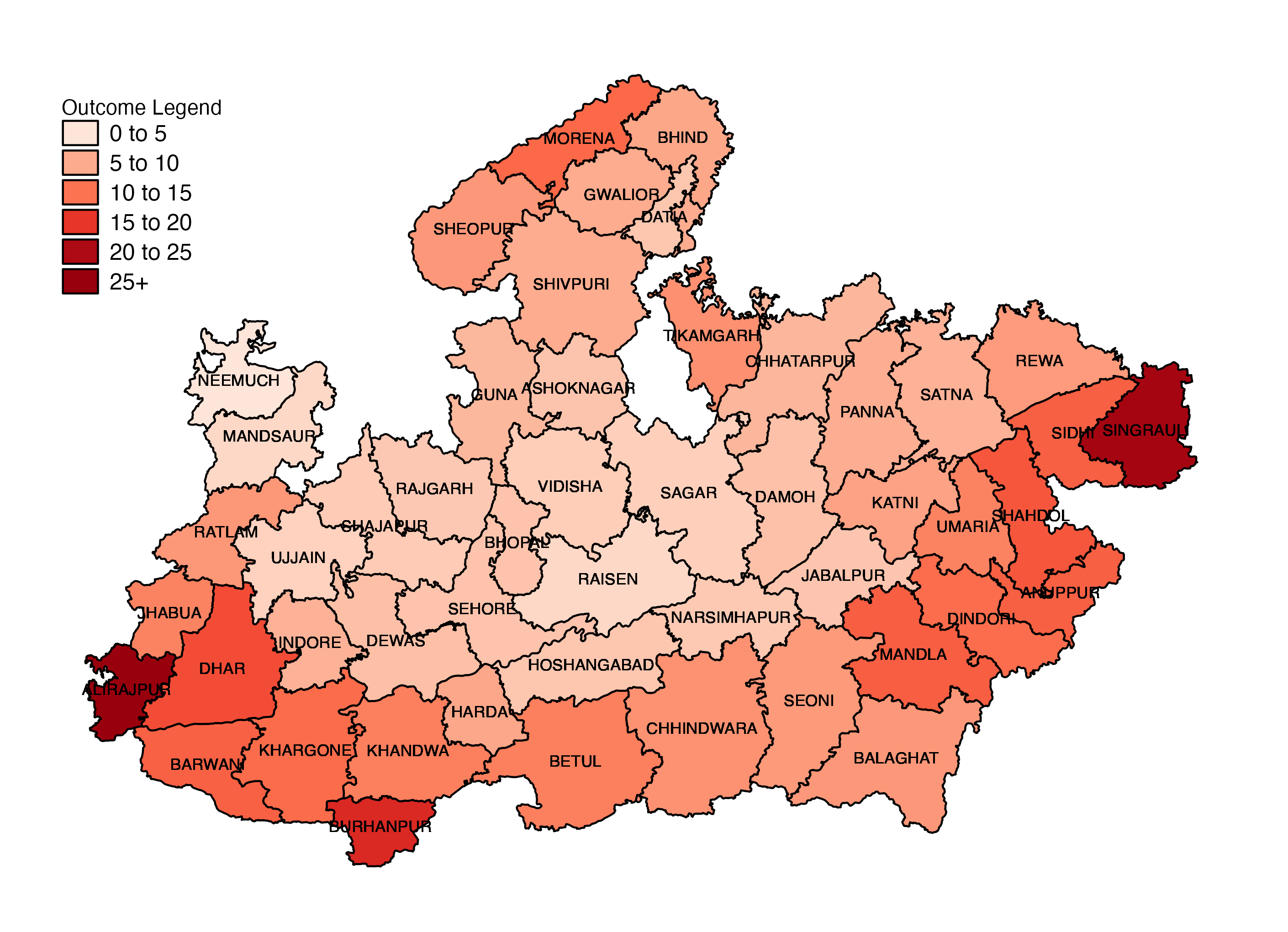
The chart
Stata

R

Data
Stata
Sample dataset can be downloaded here You will also need the shape files for Indian districts for this example
R
The following datasets have been used to create the R version of the graph:
The code
Stata
cd "C:\Users\jeffe\Dropbox (IDinsight)\Technical bootcamp online\Data Visualization\Graph examples\Map"

* Install Stata map packages
*ssc install spmap
*ssc install shp2dta

* Change the graph font here if you want
// graph set window fontface "Times New Roman"

* Convert ShapeFile to DTA
shp2dta using "2011_Dist.shp", database(ind_dist1) coordinates(ind_dist2) genid(id) gencentroids(coord) replace

* Merge ShapeFile and district predictions
use ind_dist1, clear
keep if ST_NM == "Madhya Pradesh"
replace DISTRICT = upper(trim(itrim(DISTRICT)))

	* Change district names to new names
	replace DISTRICT = "KHANDWA" if DISTRICT == "EAST NIMAR"
	replace DISTRICT = "KHARGONE" if DISTRICT == "WEST NIMAR"

merge 1:1 DISTRICT using "Map example data.dta"
assert _merge == 3
drop _merge
save labels, replace

* Graph
spmap outcome using ind_dist2, id(id) ///
	fcolor(Reds) ///
	clmethod(custom) clbreaks(0(5)30) ///
	legend(order(1 "0 to 5" 2 "5 to 10" 3 "10 to 15" 4 "15 to 2" 5 "20 to 25" 6 "25+") ///
		size(medsmall) title("Outcome Legend", size(medium) bexpand justification(left)) position(11)) ///
	label(data(labels) xcoord(x_coord) ycoord(y_coord) label(DISTRICT) color(black) size(*0.85))

graph export "Map example.png", replace	width(4000)
R
# Choropleth

################################ Initial Setup #################################
# Install required packages if they are not already in your system
packages <- c( 'tidyverse', 'mapproj', 'RColorBrewer')

lapply(packages, function(i) {if(!i %in% installed.packages() == T)
{install.packages(i, dependencies = TRUE, repos='http://cran.rstudio.com/')}})

# Loading required packages
library("tidyverse")
library("mapproj")
library("RColorBrewer")


############################# Loading dataset ##################################
# Polygons from across India
polygons <- read_csv("Data/india_district_polygons.csv", show_col_types = FALSE)

# Districts from the Indian state of Madhya Pradesh
mp_districts <- read_csv("Data/mp_districts.csv", show_col_types = FALSE)

# Data to be plotted
choropleth_data <- read_csv("Data/choropleth_data.csv", show_col_types = FALSE)


############################# Data processing ##################################

# Creating column names
colnames(polygons) <- c("id", "x", "y")

# Creating a data frame which contains only Madhya Pradesh polygons
mp_polygons <- polygons %>%
  filter(id %in% mp_districts$id) %>%
  full_join(mp_districts, by = "id") %>%
  full_join(choropleth_data, by = "DISTRICT")


############################## Creating the graph ##############################
plot <- mp_polygons %>%

  # Setting aesthetic which will be inherited by other geometric objects
  ggplot(aes(x = x, y = y, fill = outcome)) +

  # Plotting the polygons
  geom_polygon(aes(group = id), color = "black") +

  # Plotting the names of the districts
  geom_text(aes(x = x_coord, y = y_coord, label = DISTRICT),
            size = 3) +

  # Setting the albers projection for the graph. Feel free to experiment with
  # other projection types.
  coord_map(projection = "albers", lat0 = 24, lat1 = 78) +

  # Modifying the legend colors and customizing the breaks of the legend
  scale_fill_distiller(name = "Outcome Legend",
                       breaks = c(5, 10, 15, 20, 25, max(mp_polygons$outcome)),
                       labels = c("0 to 5", "5 to 10", "10 to 15",
                                  "15 to 20", "20 to 25", "25+"),
                       palette = "Reds",
                       trans = "reverse") +

  # Setting the order of the legend
  guides(fill = guide_legend(reverse = FALSE, byrow = TRUE))

############################ Formatting the graph ##############################
plot +
  # The following visual elements have been modified:
    # Removed the axis lines
    # Removed the axis ticks
    # Removed the axis titles
    # Removed the axis text
    # Removed the panel background
    # Changed the position of the legend
    # Modified the margins of the legend
    # Changed spacing between the legend keys and text
    # Changed the legend key width
    # Changed the legend key height
    # Changed the size of the legend text
  theme(axis.line = element_blank(),
        axis.ticks = element_blank(),
        axis.title = element_blank(),
        axis.text = element_blank(),
        panel.background = element_blank(),
        legend.position = c(0.1, 0.8),
        legend.margin = margin(0, 0, 0, 0),
        legend.spacing.y = unit(0.05, "cm"),
        legend.key.width = unit(0.7, "cm"),
        legend.key.height = unit(0.5, "cm"),
        legend.text = element_text(size = 12))


############################## Saving and exporting ############################
#indicating the export folder and the image file name
export_folder <- "R/Maps/Exports/"
img_name <- "choropleth_R.png"
ggsave(paste(export_folder,img_name,sep = ""))
Other details
R
Code written by Arkadeep Bandyopadhyay and reviewed by Sandra Alemayehu.