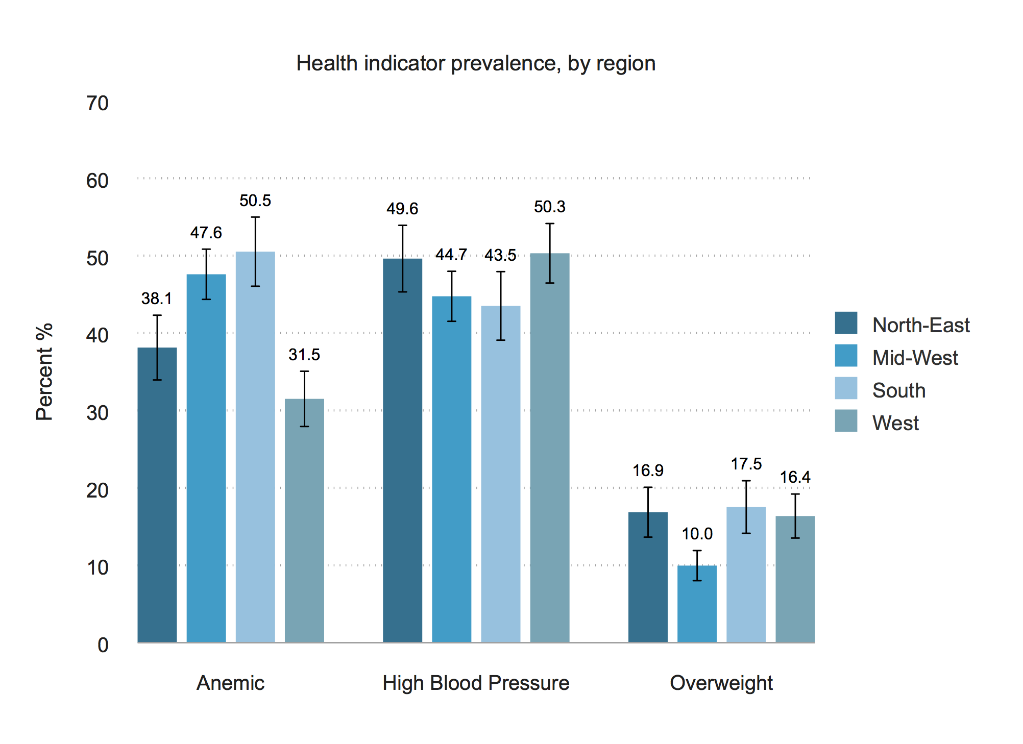
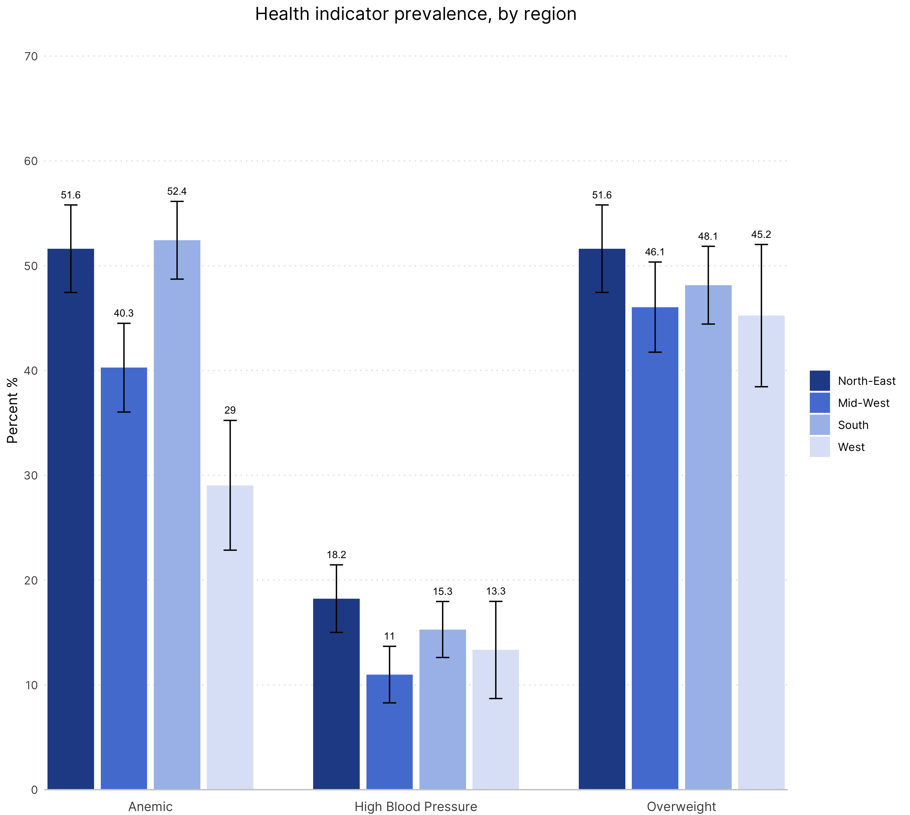
The chart
Stata

R

Data
Sample dataset in .dta format can be downloaded here. The R code uses the same dataset in .csv format, which can be found here.
The code
Stata
* Toy dataset

global data "/Users/crystalhuang/Dropbox (IDinsight)/Data Visualization Guide/3. Toy Data"
global output "/Users/crystalhuang/Dropbox (IDinsight)/Data Visualization Guide/2. Graph templates/graphs"

use "$data/toydata.dta", clear

* Set IDinsight scheme and font

set scheme idinsight
graph set window fontface "Arial"

* Graph 2 - BMI, Blood Pressure, Diabetes, by region

* Define locals for outcomes

    local outcomes anemic overweight bp_high

* Get standard errors, upper and lower CIs for each outcome var

    foreach y of local outcomes {

      g se_`y'= .
      g lo_`y'= .
      g hi_`y'= .

      * loop over grouping var
      forval i= 1/4 {

         mean `y' if region== `i'
         mat A= r(table)
         local se_`i'= A[2,1]
         local lo_`i'= A[5,1]
         local hi_`i'= A[6,1]

         replace se_`y'= `se_`i'' if region== `i'
         replace lo_`y'= `lo_`i'' if region== `i'
         replace hi_`y'= `hi_`i'' if region== `i'
       }
    }

* Collapse to get height of each bar (outcome variable mean) by grouping var (region)

    collapse (mean) `outcomes' (first) se_* lo_* hi_*, by(region)
    g id= _n

* Rename so outcomes have the same prefix for reshaping long

    foreach y of local outcomes {
    ren `y' mean_`y'
     }

* Reshape so it's one row per outcome, per group

    reshape long mean se lo hi, i(id) j(outcome) string
    replace outcome = subinstr(outcome, "_", "", 1)

* Set bar label format, make units into percent

    foreach var in mean se hi lo {
    replace `var'= `var'*100
    }

    format mean %4.1f

* Create x-axis spacing

    gsort outcome +mean
    g x= region if outcome== "anemic"
    replace x= region + 5 if outcome== "overweight"
    replace x= region + 10 if outcome== "bp_high"


* GRAPH: Vertical bars, grouped by region with CIs

    #delimit;
    twoway  (bar mean x if region==1, barw(0.80))
            (bar mean x if region==2, barw(0.80))
            (bar mean x if region==3, barw(0.80))
            (bar mean x if region==4, barw(0.80))
            (rcap hi lo x, lwidth(thin) lcolor(black))
            (scatter hi x, msym(none) mlab(mean) mlabpos(12) mlabgap(1) mlabsize(2.2) mlabcolor(black)),
            ylabel(0(10)70, format(%4.0f))
            xlabel(2.5 "Anemic" 7.5 "High Blood Pressure" 12.5 "Overweight", nogrid)
            ytitle("Percent %")
            xtitle("")
            title("Health indicator prevalence, by region")
            legend(region(lcolor(white)) order(1 "North-East" 2 "Mid-West" 3 "South" 4 "West") rows(4) pos(3))
            yscale(lcolor(none)) ;

    graph export "$output/bargraph_vertical.tif", replace ;
    #delimit cr
R
# Vertical bar
################################# Initial Setup ################################
# Install required packages if they are not already in your system
packages <- c('tidyverse')

lapply(packages, function(i) {if(!i %in% installed.packages() == T)
{install.packages(i, dependencies = TRUE, repos='http://cran.rstudio.com/')}})

# Loading required packages
library("tidyverse")

# Setting working directory
setwd("~/Dropbox (IDinsight)/Data visualization library")

############################### Loading dataset ################################
mydata <- read_csv("Data/toydata.csv", show_col_types = FALSE)

################################ Data processing ###############################
# Changing the structure of the dataset from wide to long
mydata_long <- mydata %>%
  select(personid, region, bp_high, anemic, overweight) %>%
  pivot_longer(cols = c(3:5),
               names_to = "disease",
               values_to = "disease_present") %>%
  arrange(personid)

# Converting the regions to factor variable so that we can maintain a specific
# legend order. The levels provided below dicates the order of the bars and
# the legend.
mydata_long$region <- factor(mydata_long$region,
                                levels = c("North-East", "Mid-West",
                                           "South", "West"))

# Creating the means and CIs

# Assuming 95% CI
alpha = 0.05

# Creating means and CI and storing in my_sum tibble
my_sum <- mydata_long %>%
  group_by(region, disease) %>%
  summarise(n = n(),
            mean = mean(disease_present, na.rm = T),
            sd = sd(disease_present, na.rm = T)) %>%
  mutate(se = sd/sqrt(n)) %>%
  mutate(ic = se * qt((1-alpha)/2 + 0.5, n - 1)) %>%
  arrange(disease)


############################### Creating the graph #############################
# Define axis and fill variable
x_values <- my_sum$disease
y_values <- my_sum$mean
fill_by <- my_sum$region

plot <- my_sum %>%

  # Setting aesthetic which will be inherited by other geometric objects
  ggplot(aes(x = x_values, y = y_values, fill = fill_by)) +

  # "identity" selected for stat since we want the heights of the bars to
  # represent values in the data. The default, "bin" makes the height of each
  # bar equal to the number of cases in each group.
  # position dodge applied so that the bars are not superimposed.
  geom_bar(stat = "identity", position = position_dodge(width = 0.8), width = 0.7) +

  # Setting the legend/scale colors
  scale_fill_manual(values = c("#264D96", "#5480D6", "#A8BFEB", "#DEE5F7")) +

  # Setting the x-axis labels. The expand option removes the space around the
  # axis and the data. Please feel free to change the values and see how the
  # plot is affected.
  scale_x_discrete(labels = c("Anemic", "High Blood Pressure", "Overweight"),
                   expand = c(0, 0)) +

  # Position dodge applied so that the error bars are not superimposed. The
  # width can be tweaked to ensure that are positioned correctly on top of the
  # bars
  geom_errorbar(aes(ymin = y_values - ic, ymax = y_values + ic),
                width = 0.20,
                size = 0.5,
                position = position_dodge(width = 0.8)) +

  # Customizing the y-axis by changing the limits, axis tick values and labels
  scale_y_continuous(expand = c(0, 0),
                     limits = c(0, max(y_values) + 0.2),
                     breaks = c(seq(from = 0, to = 0.7, by = 0.1)),
                     labels = c("0", "10", "20", "30", "40", "50", "60", "70")) +

  # Adding the text which will display the mean of the bars. They are positioned
  # 0.01 units on top of (mean + ic). This ensures that there is some space
  # between the error bars and the text.
  # As with previous geometric objects, position dodge has been applied here as
  # well so that the mean is not superimposed.
  geom_text(aes(y = y_values + ic + 0.01, label = round(y_values*100, 1)),
            position = position_dodge(width = 0.8),
            size = 2.8) +

  # Graph title and axis labels
  labs(title = "Health indicator prevalence, by region",
       y = "Percent %")


############################# Formatting the graph #############################
plot +
  theme_classic() +
  # The following visual changes have been made:
    # Removed x-axis title
    # Made the x-axis line a light shade of gray
    # Removed the y-axis line
    # Created y-axis grid lines which are light gray and dotted
    # Removed axis ticks
    # Removed legend title
    # Vertically aligned and resized x-axis text
    # Center aligned and resized the plot title
  theme(text = element_text(family = "Inter"),
        axis.title.x = element_blank(),
        axis.line.x = element_line(color = "grey80"),
        axis.line.y = element_blank(),
        panel.grid.major.y = element_line(colour = "grey90", linetype = "dotted"),
        axis.ticks = element_blank(),
        legend.title = element_blank(),
        axis.text.x = element_text(vjust = -1, size = 10),
        plot.title = element_text(hjust = 0.5, size = 14))

############################## Saving and exporting ############################
# Indicating the export folder and the image file name
export_folder <- "R/Bar graphs/Exports/"
img_name <- "bar_vertical_R_reviewed.png"
ggsave(paste(export_folder,img_name,sep = ""))
Other details
Stata
Credit: Crystal Huang
You must have IDinsight styles installed to get replicate the chart above.
R
Code written by Arkadeep Bandyopadhyay and reviewed by Sandra Alemayehu.
Colors for the graph have been selected from IDinsight’s brand guide.